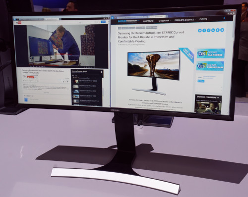
Today, I’m writing this article using a new monitor that I have on loan from Samsung. The monitor (the SE790C ) is a 34″ 21:9 unit with 3440 x 1440 resolution and is curved. That’s two new features for me as a monitor user – the wide aspect ratio and the curve.

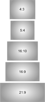 I have been meaning to try a 21:9 monitor for a while. I argued against the format for TV applications when Philips started to promote the concept some years ago. In TV, although there is a lot of very wide screen content from the movie industry, the reality is that many different wide formats have been used over the years and it seemed to me that the kind of serious film enthusiast that cares about the formats, really cares about the formats. Buying a 21:9 display and then still having some kind of black border would be frustrating.
Some TV makers claimed that the 21:9 format would be handy for showing extra content alongside 16:9 content – for example, Twitter or Facebook. In this case, I always thought that use case wouldn’t happen – Twitter and Facebook or other social media are personal media, while TV is a shared experience. The social media was always going to take place on a personal device such as a smartphone or tablet.
Nobody has yet made 21:9 TV a commercial success, although there are still attempts in very large sizes.
Monitors, on the other hand, are a different question. Traditionally, CRT monitors were 4:3 aspect ratio because this was the economic optimum for CRT manufacture. Relatively square CRTs were also easier to manage from the point of view of focus and convergence – both more important on monitors than on TVs, which had moved to 16:9 for widescreen TV (in Europe at least).
On the other hand, from the electronics point of view 1280 x 1024 (5:4) aspect ratio was higher resolution than the 1280 x 960 that would have been 4:3 and when LCDs started to replace CRTs, 1280 x 1024 was the default resolution. By 2006, 82% of LCD monitors were that resolution, in 17″ and 19″ diagonals. The higher resolution was 1600 x 1200 (4:3). When LCD makers looked at moving to wide formats, they started by taking this resolution and simply extending it horizontally to 1920 x 1200 (16:10).
Now notebook makers wanted a resolution that was 4:3 format, so that they could use the same mechanical design with different resolutions, and 1400 x 1050 was developed as SXGA+ to meet that need. Moving to widescreen, that resolution was extended to 1680 x 1050 (16:10) and the monitor market was mainly 5:4, with some 4:3 and 16:10.
 Around 2007, LCD makers started to make monitor panels in their G6 fabs, which had been designed for 16:9 TV panels and they realised that they could make 16:9 more efficiently than 5:4 or 16:10 panels, so they started to promote 16:9, especially with 1920 x 1080 resolution.
Unfortunately, for business applications, especially reading documents on the screen, vertical resolution is important and a drop back from 1920 x 1200 was a real disadvantage, so it has lingered on and around 10% of the monitor market in Europe remains in 16:10 according to data from Display Daily’s publisher, Meko Ltd.
Personally, I loved the 27″ 16:9 format with 2560 x 1440 resolution, which gave enough vertical resolution, but also gave more width. The height is comfortable and I used a Dell monitor 27″ with that resolution for a couple of years. However, recently I got hold of a 32″ UltraHD (3840 x 2160) monitor and once I had got used to the extra detail and particularly the better font rendering, I didn’t go back to the 27″.
About the only downside of the 32″ is that the height is a bit too much for me. Much of the work we do with Windows is done in the menus and toolbars at the top of the screen. At the end of a long day, having to tip my head back to look at the top of the screen gives me, literally, a pain in the neck, although I was able to push the display down on its stand to be very close to the desk surface.
So, I was looking forward to trying the 21:9 as I hoped that the ergonomics would be better for me. Unfortunately, the monitor won’t go down very low on its stand – the bottom of the display remains around 100mm from the desk surface, so the top is higher than I would like.
When I first connected the monitor, I really didn’t like the look of text, compared to the UltraHD monitor. Some adjustment of the monitor, changes of fonts and ClearType optimisation improved things and as I have got used to it, I’ve become happier with it. It will be interesting to see how I feel when I go back to the UltraHD. On the other hand, if I had just changed from the 27″ or smaller, I’m sure I’d love it! I suspect my ideal monitor would have a bit more resolution than this one – around 4096 x 1756 with a 21:9 aspect would be great.
We do a lot of forecasting and I have spreadsheets with columns up to AH and then charts beyond it. The 21:9 allows this to be viewed with space to spare.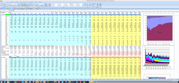
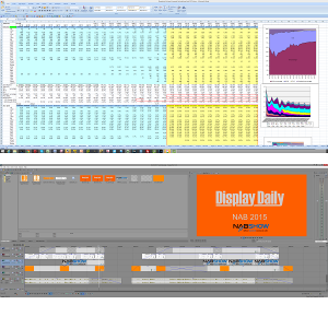
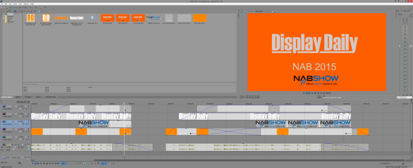
I have to edit videos for the Display Daily website and this is a great monitor for that application. The “snap to half screen” feature on Windows 8.1 is really nice, giving a 1720 x 1440 window for browsers or documents, or for programming, with the programme on one side and the application on the other.
As for the curve, it seemed slightly strange to start with, but, as usual, I quickly got used to it and it does seem to be a positive feature when used in a VA panel, where contrast is best when the light is emitted straight from the display.
Of course, if you are cynical, you would see that for a given diagonal (which is how buyers tend to judge display size), the wider the format, the smaller the area of glass. So a 34″ 21:9 monitor only uses the same glass/LCD area as a 31″ 16:9 or a 29″ 5:4! – Bob Raikes

