
The shape is the same as two 16:9 aspect ratio panels stacked on top of each other. The article reminded me that at a recent event in London run by ViewSonic to promote its VP series of colour critical monitors (which were being used to show the winning photos in a competition sponsored by the firm), I had a conversation about the shape of monitors and the future direction that was likely. Ironically, the winning photograph was a monochrome image!
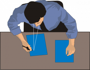
 The winning image of ‘Dead Goat Polo’ from Alain Schroeder, Belgium. Ironically, it’s monochrome
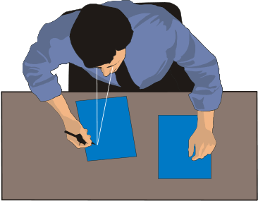
Monitors were originally based on the 4:3 aspect ratio used by CRT-based TVs. That was partly because a lot of early monitors used selected TV tubes until the market got big enough to justify developing special CRTs just for monitor use. Even then, it was much more economic to use the glass envelopes of the CRTs that were made in big volume for TVs. The 4:3 aspect ratio was a consequence of the economics of CRT design. 4:3 was the optimum balance in the cost equation, with wider or deeper shapes increasing the cost, especially of the magnetic components such the fly-back transformers.
Wide Formats Arrive from TV
TVs did develop wide formats with 16:9 aspect ratio to get closer to the shape of projections screens and allow TV to be more cinematic and there were some wide format CRTs. (I had a great one made by Sony. The 24″ GDM-W900 16:10 monitor was hand tuned for me by a technician at Sony’s TV factory in South Wales and had a great image. It weighed 41kg and I had to reinforce my desk to support it!). However, it was quite tricky to maintain the focus of the CRTs in the corner with these wide aspects, so there were not a lot made.
The key to how monitor shapes evolved was a balance between the ergonomics of the viewer and the economics of the industry, as always. My first monitor (on an Apple ][) was a 9″ monochrome Hitachi CRT. I upgraded to 12″ and stayed monochrome, but with bigger displays and more resolution until I eventually had a 21″ 1600 x 1200 Eizo greyscale monitor.
That followed the industry trend of going to bigger and higher resolution displays. After all, as Jon Peddie says, “the more I can see, the more I can do”. Displays typically stayed close to square at 4:3 (or 5:4 in terms of the image in 17″ and 19″ sets) until they got to around 21″ diagonal. This is when ergonomics kicks in. At around that height (and obviously it varies for different sized people!) the top of the display is roughly at the same level as the eyes.
Now, in human evolution, if we have been looking upwards, we have generally been looking relatively far away. Looking straight ahead, we look at a range of close to long distances, while looking down, we tend to be focusing close to the eyes – often just at the distance of our hands. So, the whole optical system in humans is optimised to make that easy. It’s positively uncomfortable to look upwards and close for any length of time. (If you doubt me trying holding something above your head, tipping your head back and reading or closely inspecting it). Further, we have stereo vision and the perception system that fuses the dual images also works best on a kind of plane that goes roughly from the knees to the extended hands at a diagonal away from the body. (There’s a lot more detail in this but beyond today’s column, but if you are interested check out terms such as the ‘vertical horopter’, ‘resting point of vergence (RPV)’ and ‘resting point of accomodation’ (RPA).
 When working close, the convergence of the eyes is easier when looking down.
Anyway, the point is that humans find it hard to spend any sustained time looking close and upward. That means that the optimum position for a display is actually below the sight line of level vision. Back in the days of CRTs, desks were sold that had angled cavities for the monitor to sit at an angle and lower.
That might make you think that the optimum position for a display might be like a notebook display – down and as close to the user as possible given the need for a keyboard. That would please those that care about visual ergonomics, but there is a catch. If the display is that low, the head is tipped much too far forward and the weight of the head causes strain at the back of the neck and the top of the spine. That upsets those that care about the musculo-skeletal ergonomics, so in the end the best display position is a balance between the two positions. It’s best for the display to be a bit further away from the keyboard and with the top no higher than the eye line. That’s why, in the EU, there are health and safety laws that mandate separate displays that can tilt and swivel for intensive display users.
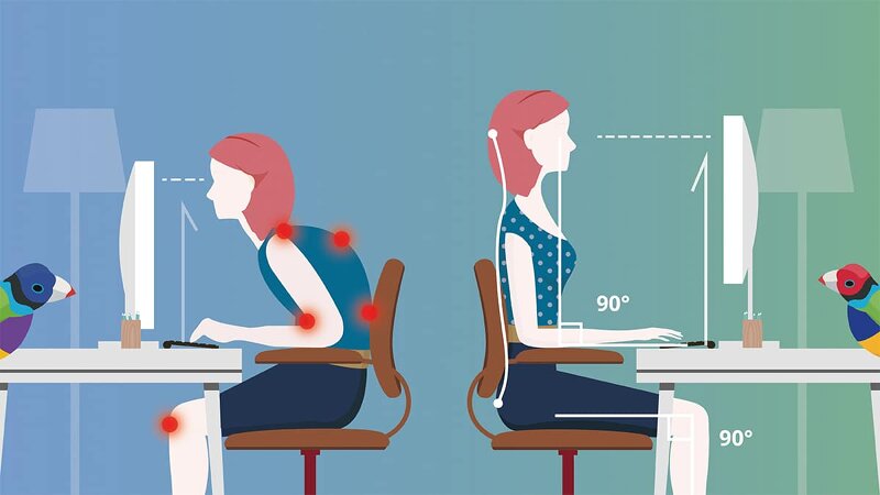 ViewSonic has this diagram among its ergonomic guidance in its Library.
It also means that once displays get to around the height of the eyes above the desk, if you want to make them bigger, you really have to go wider. This article has turned out a bit longer than I expected, so tomorrow, I’ll carry on with the second part looking at how monitor display shapes have developed now the industry has the flexibility of being able to make almost any shape. (BR)
(as this is just part one of a two part article, it will not count towards your two free recent DD articles allowance).