
Movies are just light and colour and, of courses, are just the modern way of storytelling. So colour is an important part of movie making.

The Manhattan Edit Workshop (MEW), a training centre, held a webinar that addressed the topic ‘Making the Grade:Color in TV & Film’
Jason Druss is from Frame.io and he was joined by Eric Whipp, Senior colourist of Alter Ego and Andrea Chiebak of ‘Harbor’ in Los Angeles. Druss said that the aim was to show colourists can tell the story of movies, programmes or even adverts.
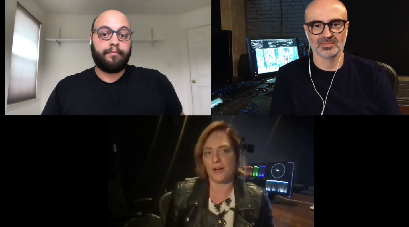 From top left and clockwise, Jason Druss, Eric Whipp and Andrea Chiebak
Chiebak is described as a ‘look development colourist’ and had worked on ‘Watchmen’ and ‘Mandy’. She said that the two projects had similarities. On ‘Mandy’, she graded the film and worked on the basic approach, but the final colourist was based in Belgium. There was a lot of discussion and work with the Director of Photography (DP) and the Director.
For ‘Watchmen’, it was different and she was brought in by the DP at an early stage to work on the overall ‘look’ using LUTs and others did the final grading. Her background was in photography and trained in various packages alongside a senior colourist and with the help of a DP on her first project.
Eric Whipp had a similar story. Like Chiebak, he started in still and motion photography and ‘fell into’ becoming a colourist when an existing colourist left after just three months or so of experience.
Both of the panellists are Canadian and Druss said that there seemed to be a ‘creamier look’ in the highlights and ‘a bit more drama in the shadows’ and perhaps more vibrance with saturation helping the story. Is there a cultural ‘look’?
Chiebak said that at one time there was a ‘Canadian’ look that was quite colourful open and light (and ‘safe’) and people had something of a love/hate relationship with it. More recent shows from Canada such as the Handmaid’s Tale or Schitt’s Creek have ‘pushed the envelope’ a bit more, which helps keep the finishing processes in Canada. Handmaid’s Tale has a very ‘dystopian’ look while Schitt’s Creek is very vibrant in colour.
Whipp graded ‘Mad Max:Fury Road’ and Druss said that the movie really ‘dictated style’ because it had such a distinct look and was so bold and new that inspired others to work in that direction. It helped many to understand the role of a colourist. Whipp said that it was a great film to work on and it was the first time he had the chance to ‘go for it’. The film was delayed for a variety of reasons so he spent 18 months or so (not continuously!) work on the title. It’s unusual to have that time for review and refining. Movies of this type had tended to be desaturated, a ‘desert look’, but the director wanted a different look with more colour.
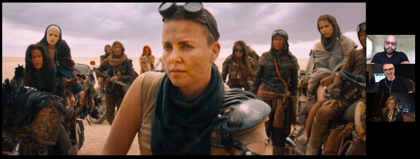 800 of the 2000+ Mad Max shots had the clouds replaced
Just winding up the saturation made the movie look like ‘an 80s music video’, so there was a need to find a different way to get there. Whipp talked through some scenes – for example, a scene where all the clouds were replaced. The sky was replaced by ominous clouds, but with the sun clearly above, which gave a sense, Whipp said, that the big decision being taken could go well or go badly. As the whole film was basically in the desert, it was basically the same scene – he thought that 800 of the full 2000 or so scenes had the sky replaced!
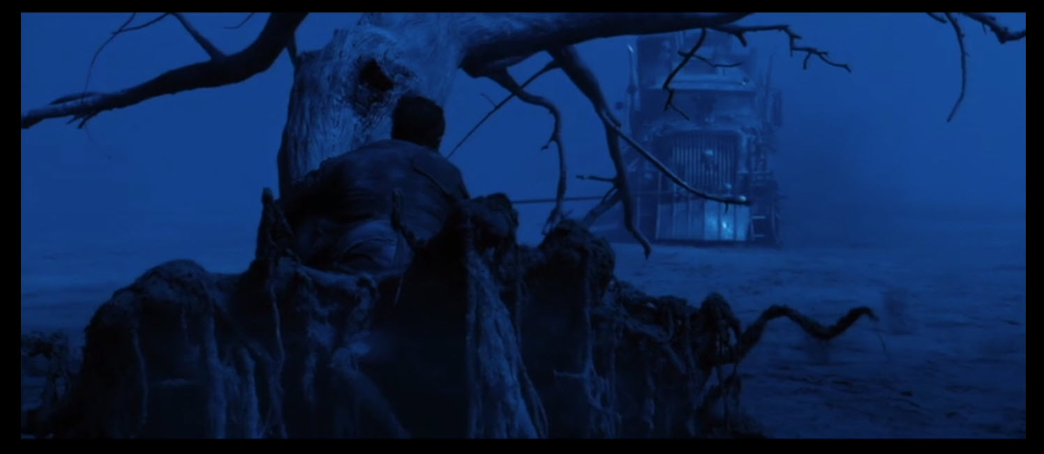 The Mad Max ‘day for night’ scenes used an unusual overexposure and blue from grading approach
Some ‘day for night’ scenes are often shot by adding a blue filter and under-exposing a bit but for Mad Max there was no blue filter and it was shot 2 or 3 stops over-exposed, which gave a ‘creamy’ look to highlights, but left a lot of detail in the shadows. The blue look was created in post and manual attention was given to pulling up the visibility of shadows where detail was wanted. Often, trying to pull out shadows in normally exposed content can give a lot of noise and ‘it all falls apart’, Whipp said. The scenes in this segment started darker and gradually got lighter during the scene to make it more comfortable for viewers, especially as it was expected to be shown in 3D where brightness was already an issue.
“Every single eyeball in the movie was ‘Rotoed’ and sharpened”. Viewers always look at a character’s eyes. In the night scenes, it really helped. Druss described this as ‘going to another level’ but Whipp said it was hard work!
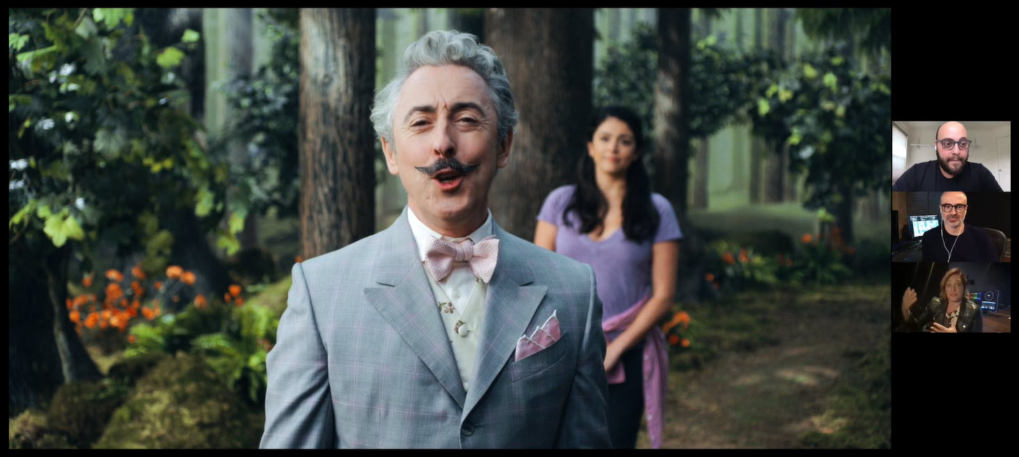 Schmiggadoon used CGI backdrops designed to look like painted sets
Schmigadoom (on Apple TV) is a title that Chiebak had worked on that is set in an environment where a couple go to a town that runs as a musical. ‘Singing in the Rain’, ‘Carousel’ and ‘Oklahoma’ were inspirations, without directly copying them. There was an attempt to take looks such as the skin tones or the way that natural materials looked. Whipp said that it had a ‘Technicolory’ look that was a little soft and blurry.
Druss said that he had assumed that many painted Mattes were used, but many levels of blue screen was used and all the background was actually CGI that was set up to look like painted scenery. It ended up in a hybrid modern/old look. The aim was to get the same feel as old content, but avoiding earlier mistakes and issues. There was a lot of discussion and back and forth with the content, the old movies and the team.
Remote Working
Turning to the process of remote working and the pros & cons. Whipp said that in commercials a lot of people were involved and it’s a lot easier to keep them all involved without needing a lot of meetings, but he missed the human discussion. Chiebak said that there is a difference because before, you had a ‘work self’ and a ‘personal self’, but that is less clear working from home. Better internet would help!
Animation vs Live Action
Druss asked Whipp about the differences between grading an animated film vs a live action. Whipp said that the first animated movie he worked on was ‘Happy Feet 1’ and when he first saw it, he said, “It looks good, what do I need to do? This will be easy”. He said that he was wrong because on the one hand it was easy because everything was possible, but it was tough for precisely the same reason. He ended up with five people working on mattes for the content, but now (e.g. for Lego 2 that he worked on) “everything is in one file” with mattes for every character and element. You can break it all the way down, but “it does get complicated” to put it back together again. A typical ‘layer stack’ would have forty layers.
Other developments that have really helped on the most recent Lego title have been in getting into the VFX. For example, if a character is looking into a mirror or through glass, he can grade the character, then re-apply the reflections or transmission effect of the glass. Compositing filters and effects are added to make the content ‘less digital’, with degraded edge focus, chromatic aberrations as if from film and even adding dust to make it look more as though real tiny cameras had been used. The dust in Baselight could be correctly lit by the CGI processes. It’s fun, but incredibly complicated!
An advantage of animations is that early lighting passes can be seen and that gives a chance to correct (e.g. making a background brighter) which can make the grading simpler later on.
Working on LED Volumes
Whipp said that he has done some commercials with a ‘cheapo’ version, but that had not worked well and ‘You could see the pixels’ and he had to blur the backgrounds to hide that. Chiebak said that she had done some work with game engines to get previews and to create and provide a LUT. The ability to change things ‘on the fly’ can be a bit overwhelming when you are used to working with a fixed 2D image. Rather than fixing in post, you can fix things in lighting or in the engine. The colorist’s role changes to advising about the final look rather than creating it at the end.
Whipp said that traditionally the DP had control of the look and that this has changed and the final result these days is much more collaborative.
On a question about influences, Whipp said that he is working on a movie at the moment that specifically references particular renaissance paintings. Chiebak said that the Dutch realists are really interesting for the way that the painters see the light. It helps to develop looks to see how light acts on surfaces. Paintings are often an inspiration for cinema because there is detail and colour even in the blacks (except, maybe, when they are Vantablack! Editor). Whipp replied that the way painters direct the eye and the job of the colorist is to do the same thing.
I conclusion, this was a really good webinar with panellists that were happy to share interesting thoughts and was moderated with skill. If the topic of color is one you care about it would be worth the time to listen. (BR)