There are times when I think I know a bit about colour, but then bits of information and knowledge come up that make me realise things are a bit complex than I might think. Here are a couple of those items.

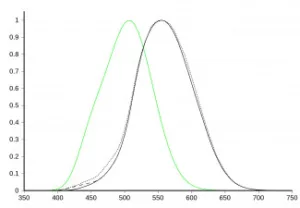
First there is the issue of ‘how nits/candelas work’. We use candelas to measure the luminous intensity of light. You might think that means counting the photons that are emitted from a display device. More photons would mean more candelas, wouldn’t it? That may or may not be case. Candelas are designed to give a way to measure the intensity of a light source, as seen by a human. Candelas are defined to reflect that the eye has three different kinds of receptors and a peak sensitivity at around 555 nanometres which is green.
So, to measure how bright a display might look, you need to take into account the frequency of the light that is being emitted. To match the subjective brightness of blue or red patches, for example, takes more photons than a green patch. That’s one of the reasons that it can be hard to create really bright displays that match, for example, to Rec. 2020. The reality is that the Rec. 2020 green primary at 532nm is a significantly shorter wavelength than the 555nm human sensitivity peak. The peak is at that colour in photopic vision – that is where the eye’s colour cones are in operation at higher luminance. (as opposed to scotopic vision when the rods in the eye are the key receptors, at low levels of luminance).
To have accurate colours, you need a good balance between red green and blue and typically you would set a mastering display to something like D6500, the white emitted by a black body radiator at 6500 kelvin. You can put out more photons to exploit the way the eye and the candela measure acts and get a higher cd/m² value, but if you then adjust the white point to get better balance, you will probably lose some brightness.
Unlike Rec. 2020, which uses very pure primary colours, Rec. 709 green is a mixture of colours but it is closer to 555nm, so for a given level of photons, there should be more candelas in Rec 709 green than in Rec 2020. The same applies for DCI-P3 where the green is, again, nearer to the human sensitivity peak. That can make calculations about the efficiency of different display technologies quite complicated.
 Graph of photopic luminosity function (black) including CIE 1931 (solid), Judd-Vos modified (dashed), and Sharpe, Stockman, Jagla & Jägle 2005 (dotted); and scotopic luminosity function, CIE 1951 (green). Using data from: http://www.cvrl.org/database/text/lum/ssvl2.htm – Sharpe, Stockman, Jagla & Jägle http://www.cvrl.org/database/text/lum/vljv.htm – Judd–Vos http://www.cvrl.org/database/text/cmfs/ciexyz31.htm – CIE 1931, the Y column of XYZ data http://www.cvrl.org/database/text/lum/scvl.htm – Scotopic, CIE 1951 The horizontal axis is wavelength in nanometers. Source:Wikipedia
Leaky Colours
The second point I wanted to cover is based on a comment that I got from Nanosys when I was in a discussion after Display Week. The firm pointed out that the hardest challenge in gettting very close to very high levels (95%+) of coverage of Rec 2020 chromaticity is that the green is quite a short wavelength. That means that blue can typically leak into the green channel, which reduces the purity of the green and reduces the coverage. You can tighten up the blue filter to cut out the greens, and that gets you better coverage. Nanosys gave an invited paper at Display Week (62-7 Quantum Dot Color Conversion for OLED and microLED Displays)
In that paper, Nanosys reported that if the blue leakage in the red and green channels goes from 0% to 1%, coverage of BT 2020 drops from 95.3% to 85.8% of Rec. 2020. You can solve that problem by adding colour filters on top of quantum dots in a system that uses blue LEDs and QDs, but that reduces efficiency, which is not desirable. A better solution is to improve the blue absorption of the QD materials so that there is less leakage. One way is just to load up the conversion film with QDs, but they are expensive, so that is not very desirable. Also, typically, the way materials are deposited (inkjet or photolithography) tends to leave a very thin film that would need to be heavily loaded with QDs.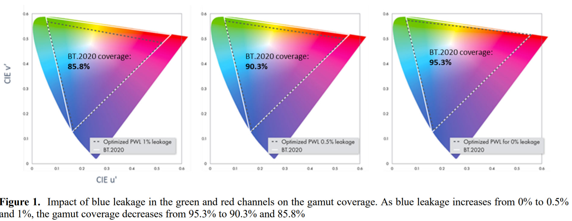
As you might guess, Nanosys has developed QDs that have enhanced blue absorption. As well as improving chromaticity range coverage, the material allows a wider variety of manufacturing techniques to be used for QD deposition. As we have reported, at Display Week Nanosys announced the new green QD material (Quantum Dot Round-up at SID Display Week 2021) that absorbs blue better and it also has narrower and brighter emission at shorter wavelengths than existing InP-based green QDs.
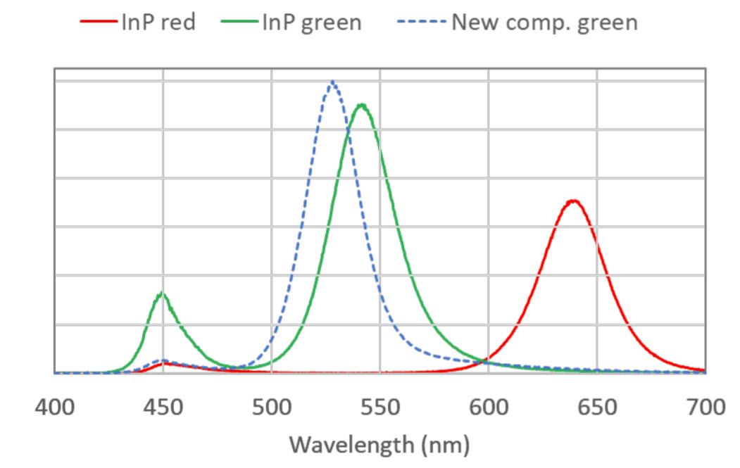 Emission spectra of ~10 µm thick QDCC films made with InP red, InP green and a new composition green QD. Source:Nanosys
One More Thing
I had planned to go onto an other topic – a feature of gamut rings that didn’t register with me when I first encountered them. (You Can’t Describe Colour Volume in 2D. Or Can You?) However, I’ll leave that for another day! (BR)