Colour has been much on my mind recently, after the recent articles on WCG and content that I published. In those articles, I talked a lot about colour gamuts and showed a 2D diagram of some gamuts shown in a standard CIE format. However, colour doesn’t really work in 2D. Or does it?

The most recent issue of Information Display has a very interesting article about a new way of specifying the colour response of displays that may have a solution to the problem. (It also has an excellent article on the Business Conference, but that is another matter? )
First, some background.
It’s widely accepted that colour can only really be expressed using three dimensions, such as RGB, HSL or XYZ. I was influenced by a talk by Dr Abhay Sharma that I reported from the Display Summit in 2015 that L*a*b* is a good way to describe colour (Sharma Calls for Industry to Measure with L*a*b* (DS10)) and I was really educated in the concept of colour volume by a couple of meetings with Karl Lang, a colour specialist that was doing a lot of work with Epson at around that time.
The takeaway that I got from this activity was that if you don’t describe the colour performance at different levels of luminance, you really don’t understand the performance of the display. (Is There a New Number for Projector Performance?)
The concept is the crux of the fight between 3LCD/Epson and TI over Epson’s concept of Colour Light Output. The three chip LCD projectors can maintain good saturation at even high levels of luminance. However, single chip DLP projectors often had an extra segment in the colour wheel that added white to boost the Ansi lumens number and brightness for some applications, but couldn’t show high brightness and good saturation at the same time. So although the numbers of luminance and colour coverage were the same, performance in real content was different. Samsung uses the same arguments about colour volume against OLEDs or LCDs that have RGBW filters.
In these arguments, the CIE chart for different displays might be the same because the luminance was not taken into account, but the 3D performance would be very different.
3D is Always Trickier
The problem is that dealing with colour in 3D is really tricky, especially when you are trying to communicate using 2D communications, such as print or pdf brochures and so the 2D CIE gamut charts tend to be ubiquitous. (As the ID article explains, they also worked very well for many years when nearly all displays were CRTs, so became ‘custom and practice’)
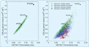
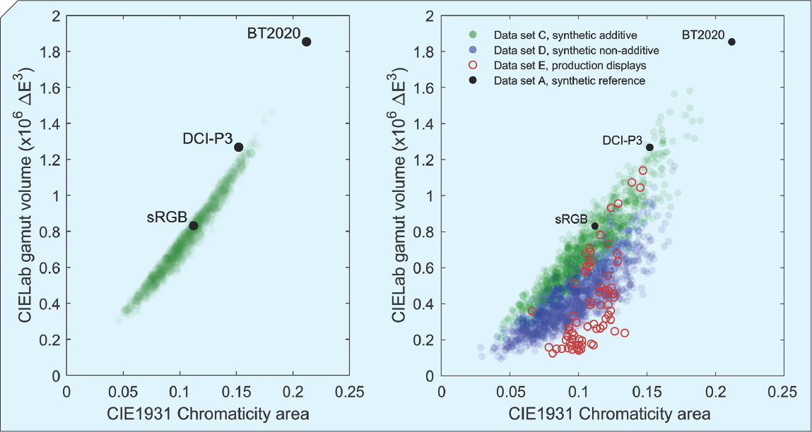 The chart on the left shows that there is a good correlation between the CIELAB and CIE1931 charts for CRTs. The chart on the right shows a range of modern displays and there is much less correlation.
The Information Display article (which includes Karl Lang as a contributor) references work by Masaoka-san of NHK that describes a ‘gamut ring plot’ that may be able to square this particular circle.
The idea is that you take the CIELAB data for a display volume and then flatten it out, by dividing it into slices with each slice flattened to an area proportional to its volume. So, if the gamut is more limited at different luminance, the lines on the plot get closer together. Hue directions are maintained so that if, for example, there is plenty of red, the lines are further apart in the read area of the diagram. Once the shape is finished, the further out the shape of the chart, the wider the range of colours of that hue that the display can show.
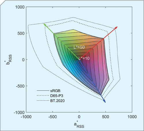 This chart shows the reference gamuts on a single ring plot.
This kind of analysis really makes it possible to compare the colour output of display devices in 2D. It also allows comparison of those that have more than just simple RGB structures, such as the RGBY design used by Sharp for TV panels at one time. It also clearly shows the restricted saturation of high luminance from RGBW architectures.
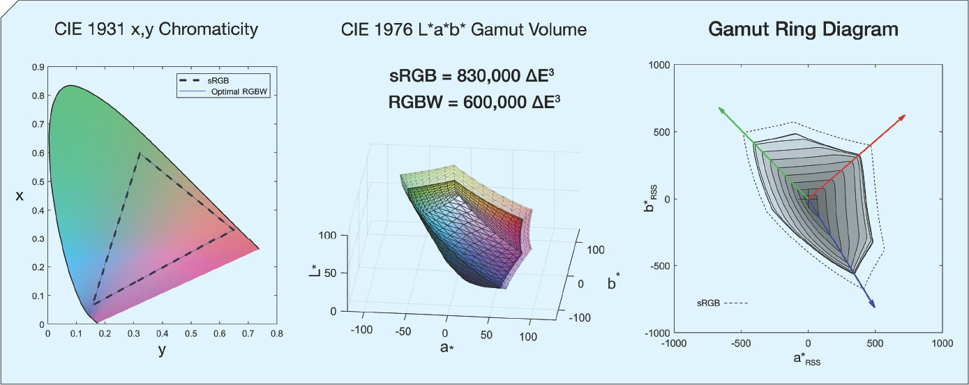 In this chart, there is a comparison of an ideal sRGB display with a display that uses RGBW. Note that the CIE1931 diagram is almost the same, while the gamut rings on the right show how the RGBW version only extends in yellow (at the top) from the previous ring and cannot reach the dotted reference gamut.
I have heard that this concept is being seriously considered by the ICDM’s Color & HDR workgroup as well as the IEC for standardisation. A correspondent that has been involved said to me that
“We’ve found real-world examples of projectors or displays that measure within 1% of each other in chromaticity area coverage and yet are off by 100% in color volume.”
That’s a compelling reason, alone, to kick the CIE diagrams into touch.
The authors* have developed an open-source Matlab/Octave add-on that can calculate gamut rings as well as allowing visualisation of the CIELab volume.
I don’t have the knowledge or skill to contribute to the standardisation, but as a publisher, to encourage the commercial of this concept, I’m happy to say that I will distribute free of charge any product release that includes a gamut ring diagram! (BR)
The authors are Euan Smith, Rodney L Heckaman, Karl Lang, John Penczek, Johan Bergquist.
Thanks to Nanosys Inc for sponsoring the release of this article from behind the Display Daily paywall. The article will not count towards the ‘free article count’ for registered users. If you or your company would like to move an article outside the paywall, please contact us.