Today, I’m going to dig down into the weeds of a topic that has become important in the display industry in recent years, especially since the arrival of HDR, and that is colour volumes. It’s a topic that keeps coming around and my most recent Display Daily article on the topic was in December (You Can Extend the Idea of Gamut Rings) when I covered important work to make colour volumes easier to understand in 2D diagrams.

I found some interesting work on the measurement of HDR vs SDR colours and colour volumes that was done at the IRT, a research institute based in Munich, Germany on TV technologies that has been winding down after a decision by its funders (public service broadcasters) to withdraw support. The Institute was unable to develop a viable model to continue. Among other things, the Institute was heavily involved in the developing and testing of 5G Broadcast.
(I visited the IRT to talk to the EBU technical group in the early days of FPD TVs to explain to them the industry dynamics. I remember that they were amazed at my forecast that the LCD makers would use 1366 x 768 panels rather than the ‘more technically logical’ 1280 x 720 panels that the EBU would have preferred and that could have provided better image quality more simply)
The work that I was interested in is still (at the time of publishing) on the IRT website and looks at the change from SDR to HDR. The work highlights that when viewed in 2D, some of the new colours in HDR (EBU Tech 3325 s1) look as though they are very close to the SDR (BT 709) gamut as you can see in this chart.
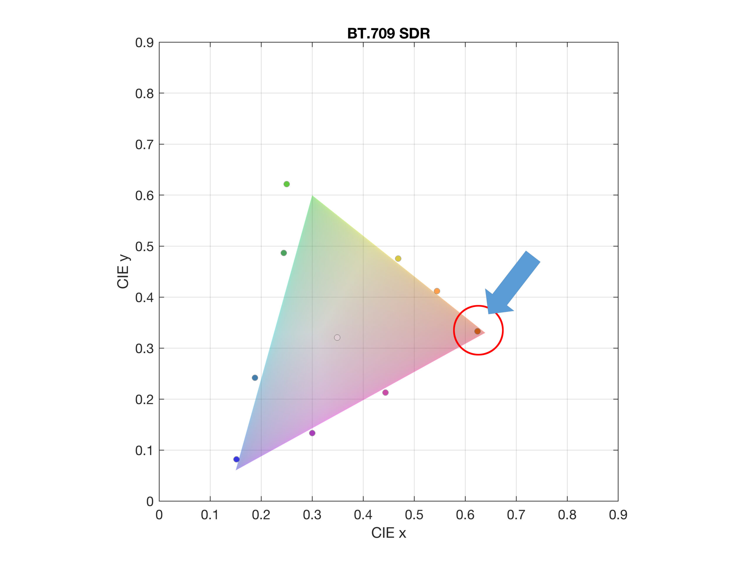 When you show the ‘new’ colours of HDR compared to a traditional BT 709 2D colour gamut. Click for higher resolution. Image:IRT
The 2D view is like looking vertically down at a 3D colour volume representation. If you change the point of view to be able to see the full 3D view, the match between the new and old colours looks very different.
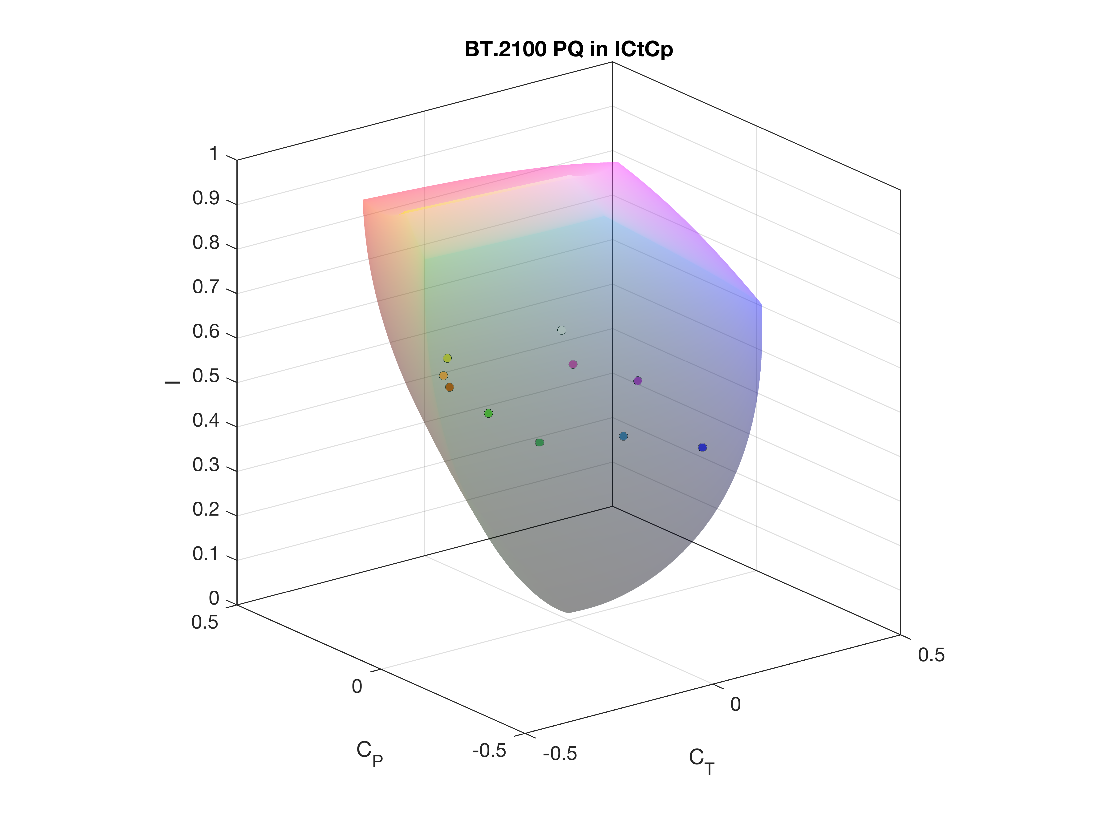
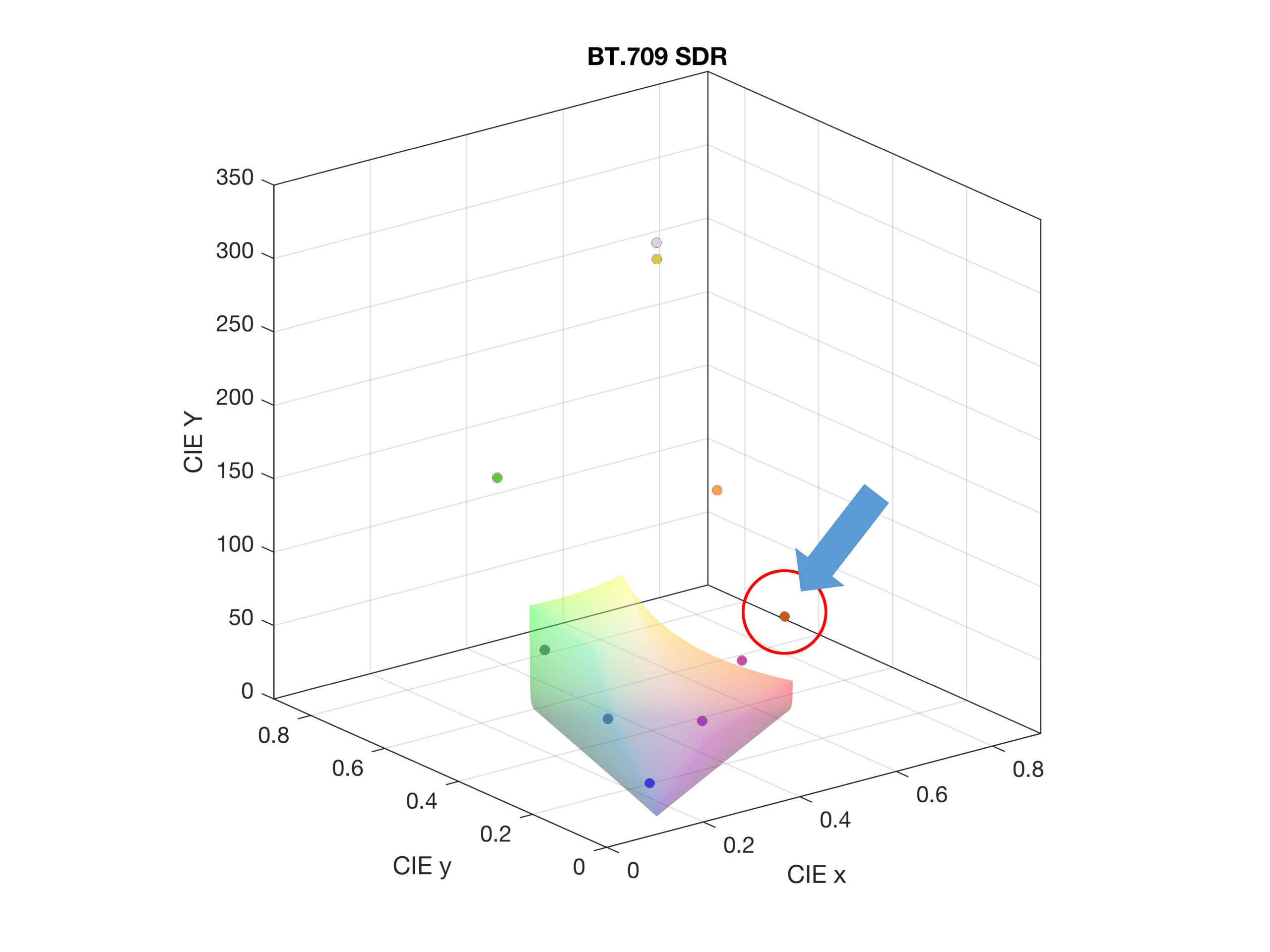 When you look at the new colours in 3D, it’s obvious that the new colours don’t match the old ones. The Y axis is the luminance. Click for higher resolution. Image:IRT
Even if you view just the lower luminance new colours, you can see that they don’t fit into the colour volume of SDR. BT.709 was developed when CRTs ruled the broadcasting world and grading was done at 100 cd/m² of luminance.
This video shows how even the lower luminance new colours do not fit into the SDR colour volume.
In the past, perceptible colour differences were generally measured as ?E*uv or ?u*v* (in 2D) . However the research work showed that these metrics are not ideal for capturing the colour differences of HDR colours. The researchers point out that ?u*v* is calculated as a function of maximum display luninance, so monitors with different maximums may mean different results for the same colour differences. For this reason, the group chose a new(ish) colour space, ICtCp, described as a constant intensity color difference signal representation. ICtCp is already specified in ITU-R BT.2100 and was originally developed by Dolby and was found to provide ‘more meaningful results’ in HDR WCG colour spaces.
In SDR, ?u*v* does a reasonable job in taking luminance into account, but this doesn’t work for HDR, so the researchers believe that it’s better to use 3D spaces for comparing colours. As ” the luminance component is not visible in a 2D representation” but “has a strong influence on colour perception since colours appear/act differently when they are varied in luminance”.
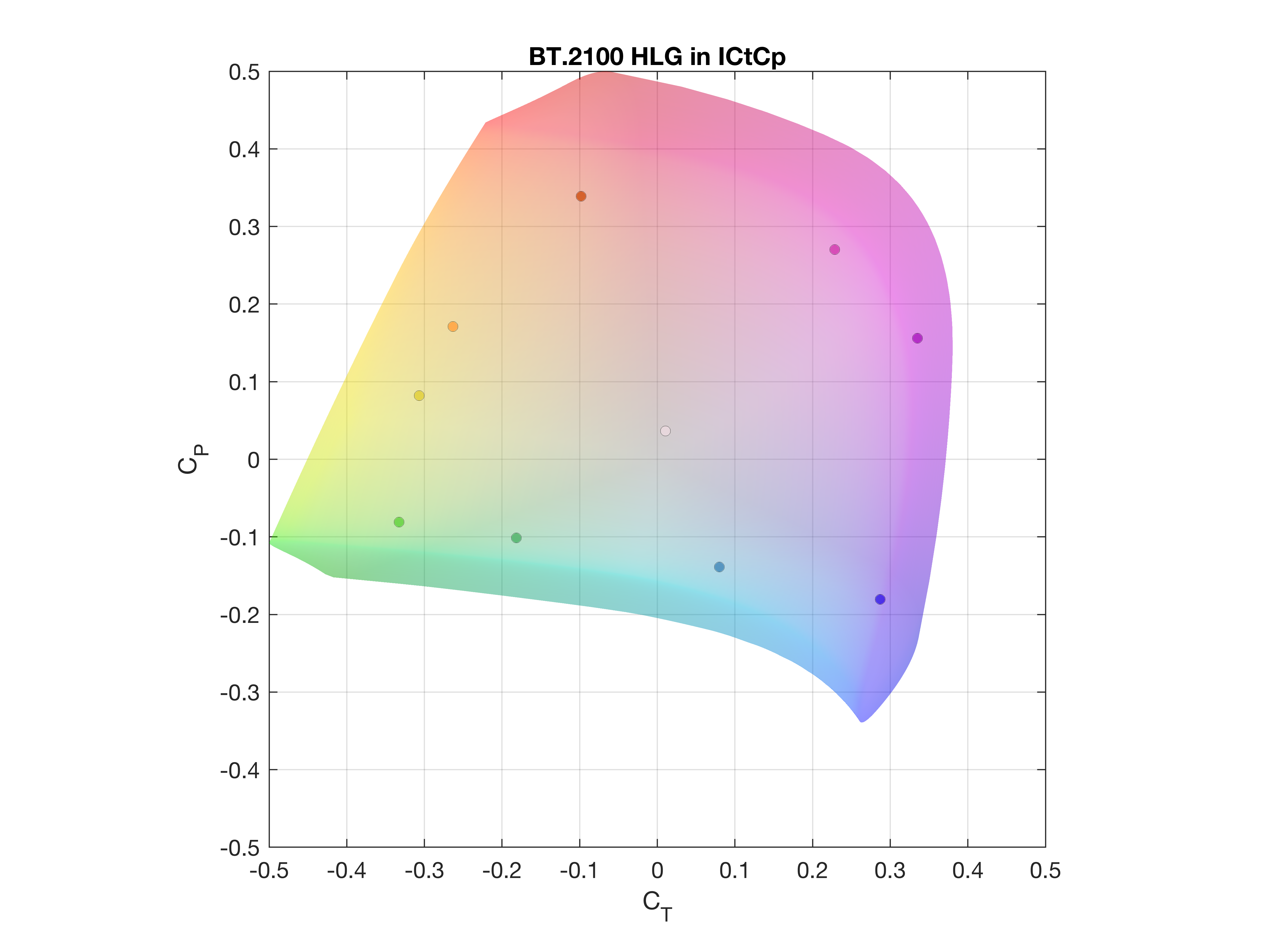
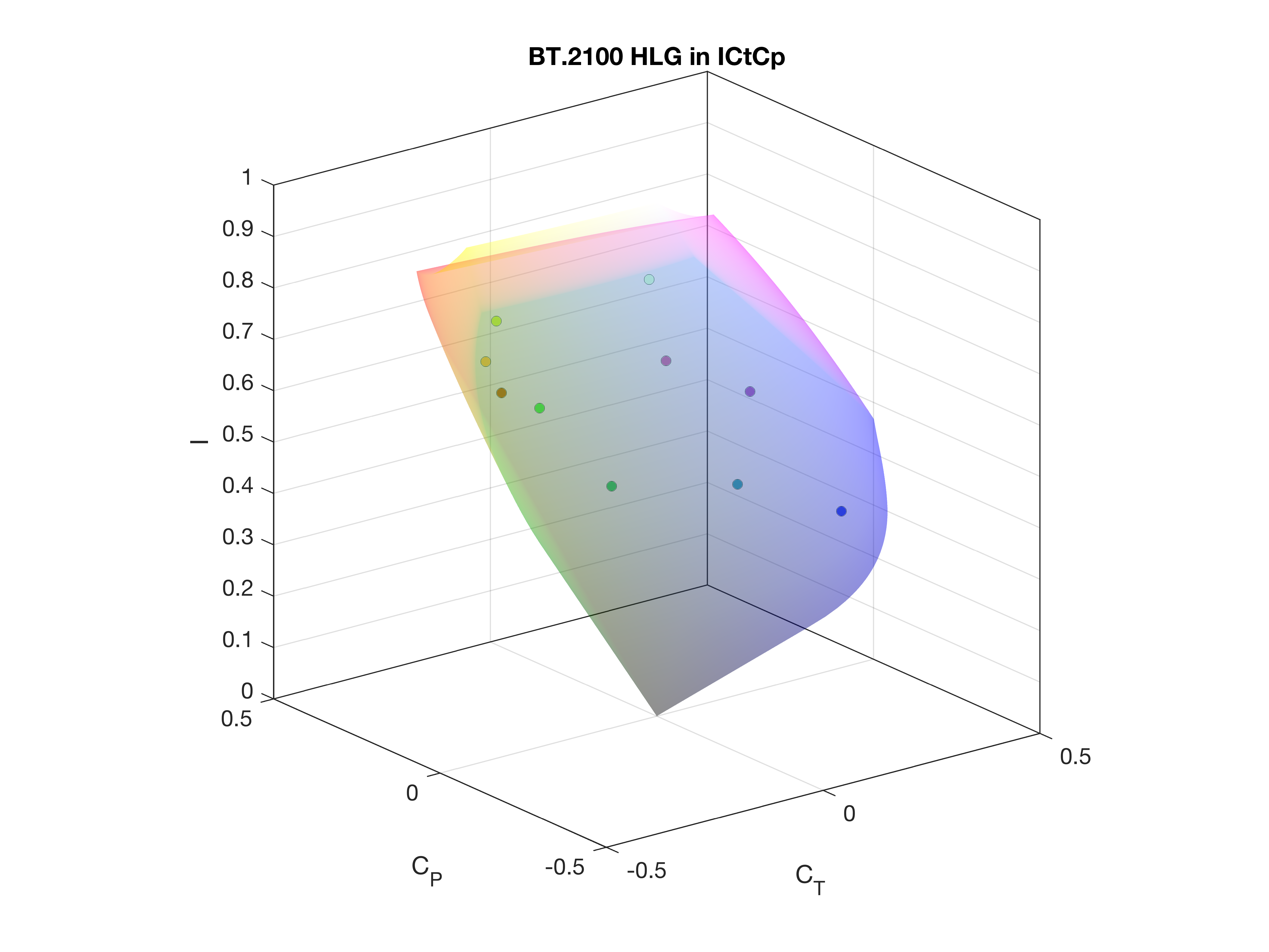
The IRT created some graphics to represent HLG at 1,000 cd/m² compared to PQ at 10,000 cd/m²
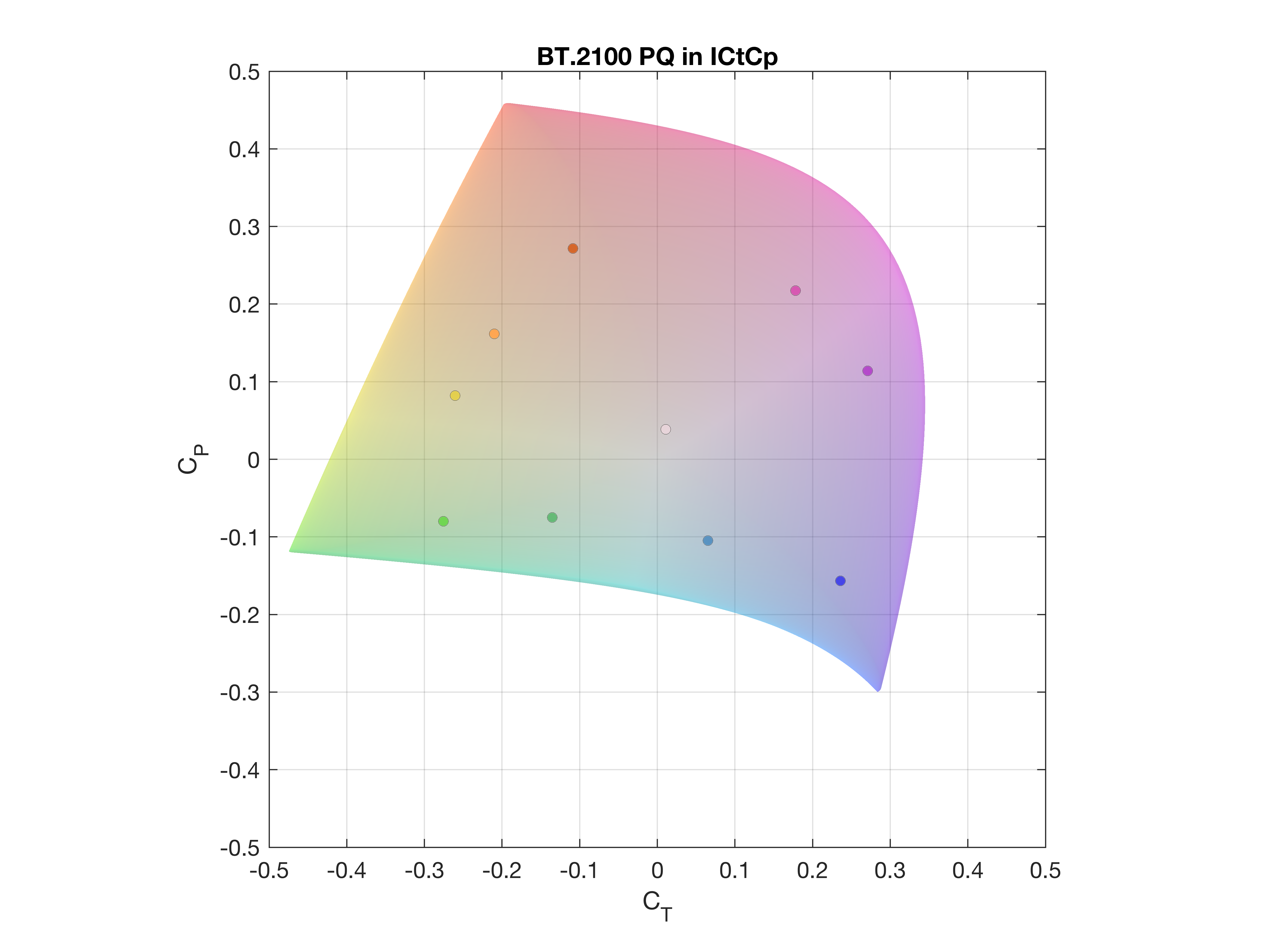
There are a number (31) interesting videos showing ICtCp colour spaces for PQ, PQ with EBU HDR colours, PQ at 1,000 cd/m² and also for HLG with and without HDR colours. It’s worth a look if you are interested in this topic.
Of course, as I discussed in the previous articles (You Can Extend the Idea of Gamut Rings/You Can’t Describe Colour Volume in 2D. Or Can You?), it’s really helpful to be able to show colour volume differences in 2D representations, rather than in 3D videos. I’m going to have to dig a bit deeper to understand the differences between the L*a*b colour space and the ICtCp colour space.
The results of the colour difference metrics described in this article were gathered during the master thesis by Justin Hug at IRT in 2020. The visualization of the colour volumes has been created by Wolfgang Dilg. Mathematical background as well as calculation for the colour volumes was done by Birgit Schmidt-Sodingen. The work was coordinated in the project “Future Video” lead by Dagmar Driesnack.