It has become possible to manufacture displays of almost any shape. One consequence of this capability is that the conventional formats used to best arrange text and other content on rectangular displays no longer fully apply. It is, therefore, quite timely that a paper investigating this topic was presented at the Conference for Human-Computer Interaction2016 during the Workshop on Shape Changing UI held on May 8, 2016 in San Jose, CA. The paper of interest was presented by a team headed by Marcos Serrano at the University of Toulouse – IRIT (Toulouse, France).
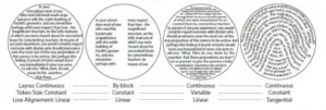
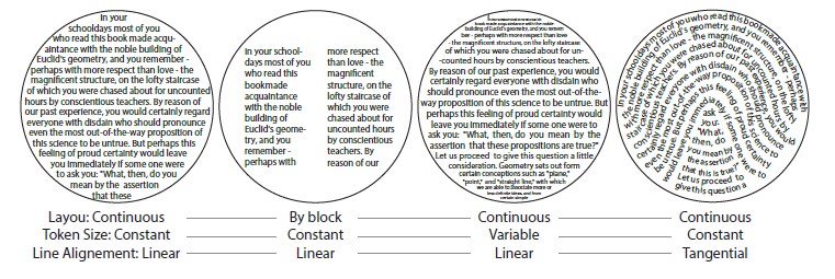
The study consisted of four legibility experiments conducted on non-rectangular displays. Based on the data collected, the team computed several display shape properties and used these to build a “framework” that identifies different mappings of text onto a non-rectangular shape. The framework describes three “axes” with increasing levels of abstraction.
- Layout: this axis describes the general text layout, which can be continuous or by block.
- Token (text or UI element) size: this axis describes the size of the tokens, which can be constant or variable. It is important to note that many deformations are possible.
- Line alignment: this axis describes the line along which the tokens are fitted. It could be linear (horizontal or oriented parallel lines) or tangential (following the shape). More generally, tokens could follow a vector field around the shape boundary. This last case is typical in text calligrams. (A calligram is text that is arranged in a way it that creates a visual image. The image created by the text is typically a visual expression of the meaning of the text.)
Several examples of text mapping are presented in the figure below.
The team then went on to conduct a series of quantitative studies to investigate the legibility of text with respect to display shape. Based on these studies, the researchers developed a set of design guidelines for optimizing text legibility on non-rectangular displays.
- Both left and right irregular alignments should be avoided, as text in these are perceived to be difficult to read. Instead, symmetric shapes are preferred.
- Shapes with circular or sharp alignments are acceptable for presenting text. They are perceived as easy to read.
- If the shape contains a hole, text should be displayed using a broken layout with two columns around the hole to prevent any impact on reading performance.
- Text on very sharp shapes should be avoided, as text on these is harder to read than on linear shapes. If used, such shapes should be filled with continuous rather than tangential text to minimize impacts on reading performance.
The researchers also investigated two different techniques for scrolling text on non-rectangular displays.
The main finding is that, to use dynamic scrolling on non-rectangular display shapes, text should be formatted so that each line contains the same amount of text. This format is perceived as “beautiful and clean.” When using page scroll, the text size should be kept constant.
The team notes that there is a clear need for further study to fully understand how to best format content for presentation on non-rectangular displays. Several topics where future study is needed were identified in the team’s paper.
The most generally statement of the future challenge was expressed as a need to explore possible mappings of UI content into a shape. Paraphrasing from the team’s article, the starting point in this analysis was to identify preliminary token semantics which were defined as follows.
- Free: there is no intrinsic relation between the tokens and they can be placed randomly. Example: tokens = icons of apps to place on a screen, their position does not matter.
- Sequential: the tokens have a sequential order but they can be broken into lines and columns. Example: tokens = characters.
- Fixed in one dimension: the tokens have a sequential order but they cannot be broken into lines and columns, they are constrained to 1 dimension. Example: a color strip in which it is important that each token is located next to its two neighbors.
- Fixed in several dimensions: the tokens have a logical order in a 2D reference system. This is the typical case where tokens are pixels in an image. This could also correspond to tokens being graphical elements in a UI such as a map or a tree. Another typical case is a keyboard (tokens = keys).
Aside from tokens, another form of complex content is images. The best formatting of images on a non-rectangular display also raises questions. For example, should images be cropped based on the underlying display shape or should images use variable shapes to fit the contained display? Furthermore, aside from the shape of images, should their position vary based on the shape of the display, so that they always appear as taking the most available space for any given image.
Also needing investigation are the best means for the user to interact with content presented on a non-rectangular display. Such interactions include zooming and reaching for off-screen content.
These and other questions will be the subject of further investigations by the team. -Arthur Berman
University of Toulouse – IRIT, Marcos Serrano, 05-61-55-7405, [email protected]