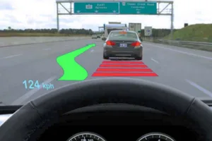
Head up displays (HUDs) are all the rage in new car models these days. Firstly, they look cool and secondly the most desirable high end models have them installed by the factory. From a usability or safety perspective, most manufacturers quote the use of HUDs in airplanes where safety is paramount. However, there are no studies available that were performed specifically on driving cars.
The University of Toronto has now released results from a study addressing the way people react to multiple stimuli in the field of vision. The study was performed by Professor Ian Spence from the Department of Psychology. He and his co-workers, Yuechuan Sun and Sijing Wu, designed two computer based tests to measure the impact of additional information presented to a person.
The first test had a varying number (between one and nine) of randomly placed spots on the screen and the participants were asked to report the number of spots appearing when prompted. There was also a secondary stimulus in the form of a black outlined square and the participants were asked if the additional square was present or not. The test revealed that when the black square was absent the accuracy was very high in saying there was nothing there, on the other hand when the square was there, one in fifteen responses missed the square.
They also saw an increase in the wrong answer rate to one in ten, when the number of detected spots was higher. Not surprisingly, the error rate in reporting the correct number of spots also increased when the number of spots was higher. The team concludes that this result is “suggesting that as a primary task becomes more demanding, both tasks compete with and interfere with each other”.
Source: University of Toronto
The team also asked how a driver would react to a specific shape of random points. This simulates a driver having to identify a certain form of warning in relation to the real world scenario. An ‘incoming call’ notification may be be detrimental to suddenly stopping in traffic, for example.
Participants were asked to identify a specific shape (triangle, diamond, etc.) to be identified among the randomly appearing shapes. As before, with a higher number of spots shown, the accuracy of identifying the specific shape decreased.
This basic research shows that adding warning signs in the line of sight may be better than showing them on the dashboard or on the main screen, off to the side. However, adding to many warning and information signs in the visual field may confuse the driver and potentially make him miss important information. As one would have guessed, more is not always better when it comes to warning signs. Now it is up the car makers and governments to figure out what is good and what is detrimental.
The study “The commingled division of visual attention” was published this month in PLOS ONE. The research was funded by a Discovery Grant to Spence from the Natural Sciences and Engineering Research Council of Canada. – NH

