
A while back I wrote in Display Daily about an article by Katie Sherwin of the Nielsen Norman Group (NN/g) titled Low-Contrast Text is Not the Answer.

As I mentioned at the time, the use of low-contrast text as a design element for some web sites has irritated me and continues to do so. A few months later there is both good news and bad news concerning what Ms. Sherwin described as a design trend that leads to text that is “illegible, undiscoverable, and inaccessible.” In more detail, she critiqued low-contrast text stating, “A low-contrast design aesthetic is haunting the web, taking legibility and discoverability with it. It’s straining our eyes, making us all feel older, and a little less capable.”
I revisited some of the websites that Sherwin cited as examples in her article. The more recent screen shots taken from Squarespace.com and Quartz (qz.com) shown below appear to reflect a reconsideration of the low-contrast design approach to some extent, but still incorporate numerous low or reduced contrast elements.
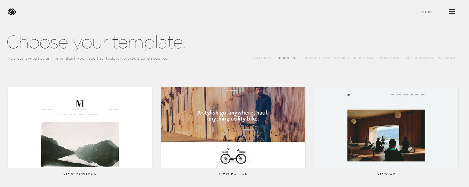 Source: Squarespace.com
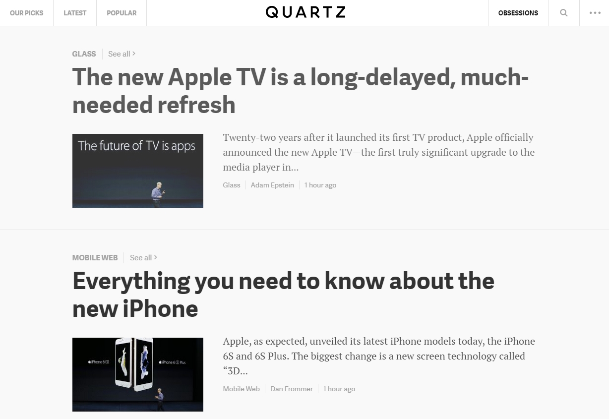 Source: Quartz
Apparently, the use of low-contrast text as a web page design element is not going away. I was again reminded of this fact when I was recently conducting web research on ultraviolet light emitting diodes (UV LEDs). UV LEDs are interesting and under intense development at present since they offer the promise of improved means for water, air and surface disinfection, as well as for materials curing and medical applications. In conducting my research, I visited the website of RayVio a Hayward, CA based start-up developing and manufacturing UV LEDs. In addition to wanting to learn about RayVio the company, I was eager to view the firm’s web pages describing the applications of UV LEDs. The screen shot below from the RayVio website really frustrated me.
 Source: RayVio
While I could tell that the RayVio web page had a good deal of information that I sought concerning UV disinfection and more, the website design made me feel I was “straining our eyes, making us all feel older, and a little less capable”.
At this point, in frustration I simply opted out and Googled “low-contrast text web page design”. In response to my outreach, Google of course pointed directly at the Nielsen Norman Group article. However, I was led to another link that pointed out that the Chrome Browser has an extension entitled High Contrast which is aimed directly at the user challenge of low-contrast text. The screen shot below illustrates the same web page as the figure directly above with the Chrome High Contrast extension setting selected for “Increased Contrast” rather than “Normal”.
 Source: RayVio
While the screen shots above don’t fully reflect the degree of improvement in readability provided by High Contrast, you can quickly install the extension and experiment with it yourself. Suddenly I did not feel so old, eye strained, or as incapable. Moreover, my display looked better when rendering text with higher contrast. As great as our technology is, designers can produce good, bad and indifferent designs, even unusable designs. However, in the case of low-contrast text web design, there is a means to cope, and that is the good news. – Phil Wright