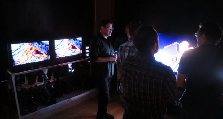
Sony hosted an event on August 31st in New York titled “Monitoring for Color Accuracy and HDR Imaging” that focused on the use of Sony OLED professional monitors for production, post production and color grading applications. Three types of Sony OLED monitors were on display: the 4K HDR BVM X300 master monitor, the PVM X550 high grade monitor and the BVM E171 critical reference monitor. Gary Mandle, Sr. Product Manager for Sony Electronics, discussed each monitor one-on-one with me and how it would be used in producing HDR content. None of these monitors is a new product but Sony was showing an upgrade to the PVM X550 that has not yet been released.
 Quite properly, Sony was demonstrating its HDR OLED Monitors in a darkened area. (Credit: M. Brennesholtz)
In the first demonstration, two 4K HDR BVM X300 master monitors were shown side-by-side with the same content. The content had originally been sourced using Sony F55 cameras and acquired using the S-Log Opto-Electronic Transfer Function (OETF). For one monitor, the RAW content was then color-graded for Rec. 709 and a gamma of 2.4. For the other monitor, the same original RAW content was color-graded for HDR-10, using Rec. 2020 encoding and the PQ Electro-Optical Transfer Function (PQ EOTF). The BVM X300 is not a new monitor and this was not a new demonstration. Still, it was nice to see the contrast at a more casual event, where I could spend unlimited time comparing the two monitors through half a dozen cycles of the content while discussing what I saw with HDR experts from Sony and event attendees who were mostly from the New York production and post-production community.
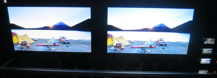 SDR (Left) vs HDR (right) shown on Sony BVM X300 Monitors. (Credit: M. Brennesholtz)
While my SDR camera did not really show up the difference between the SDR and HDR signals, the difference in person was quite noticeable. Highlights such as the sun rising over the mountains were much brighter on the HDR monitor, even when the rest of the scene appeared to be about the same brightness. This, of course, is one of the main claims for HDR: highlights are brighter and there is more detail in both the highlights and dark areas. While these detail effects were noticeable in the demonstration if one looked closely, what struck the viewer most was the brighter highlights. This is not only what struck me, but I talked to several other attendees who also commented more on the high brightness than the added detail in the highlights and lowlights.
In a few scenes on this demo reel, there were also slight differences between the colors shown on the two monitors. According to Mandle, the same colorist did the color grading for both pieces of content. The differences between the colors on the two monitors were probably not attributable to the difference between the Rec. 709 and Rec. 2020 color gamuts because they were mostly in desaturated colors that could be reproduced by both color gamuts. For example, in a scene with geese flying at dawn, the color of the light on the Rec. 709 was slightly pinkish compared to the color on the Rec. 2020 monitor. In another scene, a tent had two slightly different colors on the two monitors, even though the same tent in other scenes showed the same color on both. I attribute this difference to the colorist, not the technology. It just shows how difficult it is to exactly reproduce results when a human is involved.
Demo 2 Compares HDR
In the second demonstration, a 55” (140cm) PVM X550, a 30” (76cm) BVM X300 and a 16.5” (42cm) BVM E171 were set up side-by-side and were all showing the same HDR content.
The primary application of the PVM X550 is for content quality control and review, especially by customers of a post house. It uses color-by-white OLED technology with white OLEDs (actually blue plus yellow) and a color filter array. It has UHD (3840 x 2160) resolution and a nominal peak output of 400 cd/m². The unit shown by Sony in this HDR monitoring event actually had a peak output in the HDR mode of 650 cd/m². This increase in output is not a hardware change to the display but a firmware change in how high-brightness color/luminance combinations are processed for display. According to Mandle, this firmware change was made at the request of Sony customers who were more concerned about high peak brightness in the HDR mode than with the precise following of the specification. He said this firmware update will be available to all existing owners of PVM X550 monitors in about 6 weeks at no charge to the customer.
The BVM X300 is used primarily in the color grading suite and can be thought of as the master monitor, against which all other monitors should be compared. It uses RGB OLED technology and has a standard luminance of 100 cd/m² and a peak luminance of 1000 cd/m² in the HDR mode. Resolution is true 4K (4096 x 2160). According to Mandle, the Sony BVM X300 monitor is the premier monitor for color grading 4K HDR content. He said that Amazon, Netflix and all six US movie studios require that 4K HDR content be color graded on this monitor.
The BVM E171 is used primarily for on-set applications such as the monitoring of camera output in real time by the director and others. It also uses RGB OLED technology and has a standard output of 100 cd/m² plus a peak output of 600 cd/m² in the HDR mode. It has full HD resolution (1920 x 1080).
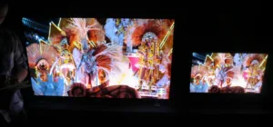
The content shown was Carnaval and very colorful, to put it mildly. In addition to saturated colors, dark shadow areas and a lot of motion, there were many specular highlights coming from mirrors and sequins on the Carnaval costumes. Again, my SDR camera does not do justice to the HDR content shown on the monitors.
Carnaval content shown on the Sony PVM X550 (left) and the BVM X300 (right) monitors. (Credit: M. Brennesholtz)
Despite the differences in size, technology, resolution and peak output, the images on the three monitors were virtually identical. This, after all, is the purpose of a reference monitor: to make the content not only look good, but to make it look the same, regardless of whether it is on the set, in the color grading suite or in the conference room being reviewed by the customer. –Matthew Brennesholtz