I’m a self-described data geek. Give me a data set and I’ll scour it for trends, outliers, winners, and losers. I really enjoy a nice visual graphic that takes a set of complex data and distills it down to something digestible. I hope I’m able to do that here. As this year comes to a close it seems like a good time to revisit a data set from RTINGS.com that I wrote about nearly three years ago entitled “It’s 2020, so where is Rec2020?”
RTINGS was gracious enough to share data from over 300 unique TVs from the past 5+ years which allowed me to investigate trends over time, by manufacturer, and also by TV type. RTINGS captures a lot of data on all the TVs and monitors they test (if you have used their interactive table tool you know what I mean!), but today I will focus only on two metrics within the TV category: TV Color and TV Brightness.
Quick disclaimer. I can’t speak to the accuracy of the data or measurements, although I have generally found RTINGS to be a reliable and non-bias source for this type of data. For more detailed information about the measurements made by RTINGS.com please visit their site. Also, this is by no means a comprehensive data set. Yes, 300+ data points is a lot, but there are many more TVs out there, especially in different parts of the world.
On to the DATA! First let’s deal with color.
I split the data up into three types of TVs. LCD, OLED, and QLED (which for our purposes I’ll define as an LCD with QD technology in it). QD-OLED falls squarely in the OLED category, but I used a triangle to denote these two data points (Samsung S95B and Sony A95K). Then I sorted by manufacturer which you can see in the graphic below is represented by different colors. This allows me to look at the trends within each technology type over time as well by each manufacturer. Since I’m particularly interested in wide color gamut TVs, I heighted the portion of the graphic where the color gamut reaches >90% DCI-P3 xy (left). In addition, I analyzed the measured color gamut in Rec2020 color space (right), also highlighting >90%… a challenging target that (so far) none of the measured TVs have reached! Take a minute to digest this data and then I’ll share my thoughts.
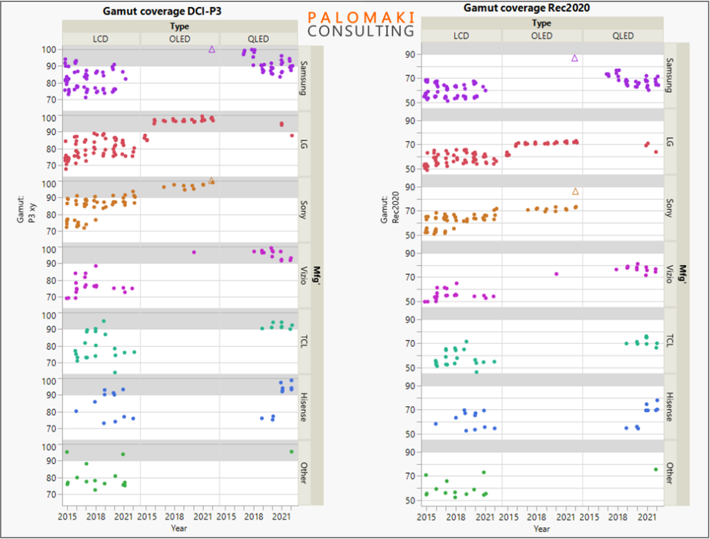
So… what trends do you see? Here are a few of my observations:
- Did you notice how OLED data is tightly grouped, and all OLEDs since 2016 fall withing the WCG category for DCI-P3? And that the gamut has been steadily increasing every year (see Sonly data set in purple).
- LCD data seems to fluctuate considerably and is highly dependent on the manufacturer, with data points from <65% coverage of P3, up to >90%. Of course this data mixes budget LCD with high-end models, so the spread is perhaps not surprising.
- QLED data is interesting, with almost all falling in the WCG >90% P3 category, except Samsung where roughly half of the data points in recent years fall just shy of this mark.
- Trends (but not absolute values) in Rec2020 gamut are similar to DCI-P3, with the two QD-OLED models nearly reaching the Rec2020 90% mark. However the other OLEDs plateau at 70-75%.
I’m a “visual learner” and probably looked at this data a few dozen different ways. This gamut graphic I felt was also worth sharing.
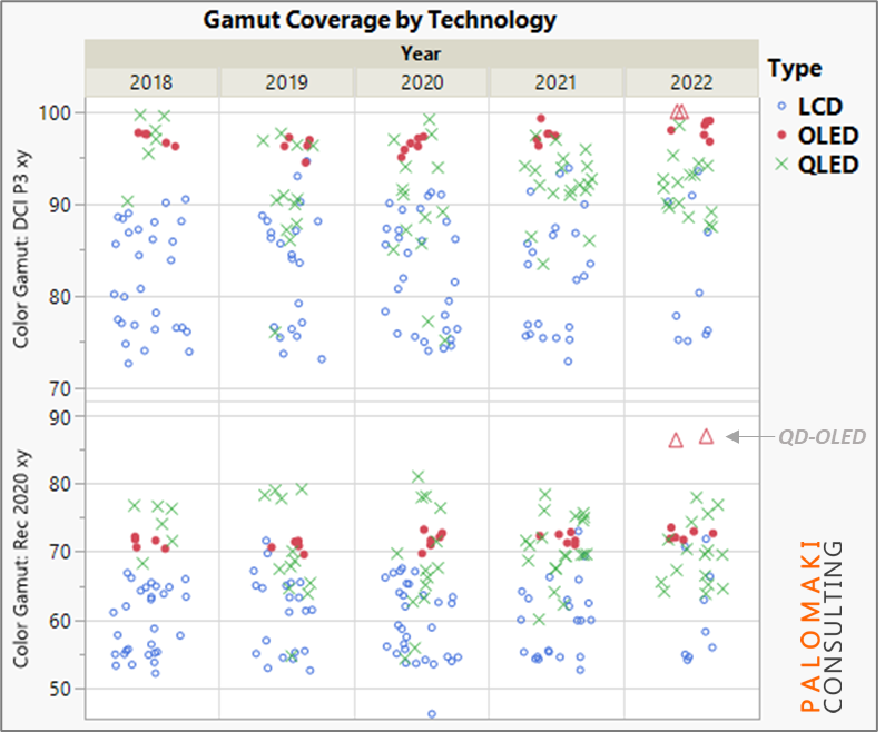
[Cue Christmas music] “Do you see what I see”…
I see that the OLEDs and higher performing QLEDs do a great job covering DCI-P3 (>95% in many cases, top half of graphic). However, when we look at Rec2020 (bottom half of graphic) the QLEDs tend to outperform the OLEDs. No surprise that the two QD-OLEDs outperform all others by leaps and bounds when it comes to Rec2020 coverage! I assume this measurement was made in such a way that the display was not mapping color gamut to a smaller color space (see my piece earlier this year: Give me back my Gamut, QD-OLED!). The fact that QDs are able to achieve better coverage of Rec2020 is due to their continuously tunable, narrow emission spectrum that can be customized to meet specifications required when optimizing for different color spaces. OLEDs on the other hand are fixed in their emission spectrum with discrete options for tunability.
On to brightness.
RTINGS makes a litany of brightness measurements which I won’t get into. I selected the “Real Scene” brightness measurement as I felt it most accurately represents how many people use TVs. No, not everyone has a dark basement theater with black seats and black paint on the walls in which to view their OLED. Here are the results split out by TV type over the past six years.
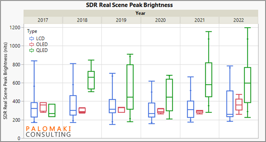
I realize the box-and-whisker plot may not be familiar to everyone, so feel free to google it if you are curious about all the lines and markers. Essentially what I see here is the following:
- LCD and QLED have a very wide range of brightness. Some QLEDs in the past two years have reached >1000 nits in this metric. In general, the outliers tend to be on the high side. Remember I’m mixing $250 TVs with $2000 TVs here so I suspect the few high-brightness TVs are the more expensive ones and RTINGS tested relatively fewer of these, perhaps because each brand has only one or two high-end TVs every year but dozens of lower priced models.
- OLED grouping is very good, but brightness is (no surprise here) not so great. This has been a drawback of OLEDs for years. 2022 looks better than past years, in part due to the two QD-OLEDs in this category as well as the advances LG has made such as including deuterium to enhance brightness/reliability.
Again, there are numerous ways one can look at “brightness” and I choose only one here. I admit this is somewhat short sighted.
Finally, I want to make an attempt to merge the brightness and color metrics. Color volume is now the proper way to characterize the ability of a TV to display wide color gamut content at a range of brightness levels. This is important for HDR displays and content for example. Samsung has made a valiant effort to describe this phenomenon to the consumer, but it’s no easy task. I will not attempt to do so here but I do hope to cover this in a future article. Here’s the data set, once again split out by TV type.
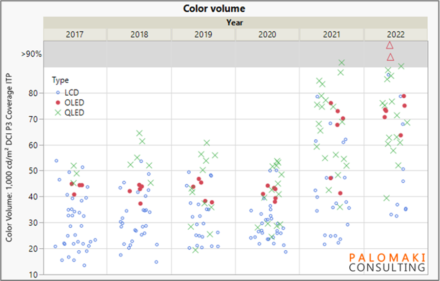
Some observations on color volume:
- The minimum color volume has increased year over year – even the cheap LCD TVs are getting much better!
- The spread in QLED data really widens (on the low end) in 2019. I wonder if this is when QLED started to penetrate the lower cost TVs and some design choices were made that resulted in lower color gamut/brightness/color volume. The “worst” QLEDs continued to improve in the years following.
- A giant leap in the maximum color volume occurred in 2021 across all TV types with color volume skyrocking from 55-65% max in the prior years, to >90% in 2021 and 2022! I wonder if mini-LEDs were the driving force here. Though OLEDs were no exception, seeing a substantial bump (perhaps the deuterium again?).
- QD-OLEDs take the cake with a great combination of color and brightness.
I hope you enjoyed this deep dive with me and welcome your thoughts on the trends you see in the data. After all, we all see through a different lens.
Peter Palomaki is the owner and chief scientist at Palomaki Consulting, a firm specializing in helping companies solve big problems at the nanoscale. His utilizes his expertise in quantum dots and materials chemistry to solve challenging problems with clients large and small. If you enjoyed the data analysis in this blog post please reach out to Peter to see if he can help your company make sense of complex data sets.
Editor’s Note