Famous brands often have an almost religious attitude towards the colour of their brand images, paying a lot of attention (and money) to ensuring that ‘their’ colour scheme is scrupulously respected. Some colours literally became public icons, even being used as adjectives, like a ‘Ferrari Red’ or ‘British Racing Green’.

Our senses and subliminal expectations of such colour descriptions would probably be baffled if we saw an ‘orangey’ CoCa Cola red logo, or a pastel Green Benetton logo.
Ask the pre-press or print professionals, or specialist suppliers like Eizo. Colour management and consistency have always been core concerns for graphic designers creating digital artworks. They must ensure that the colours they use look consistent from design on the display to the final print. So this is nothing really new.
What’s new, though, is our tolerance in accommodating growing variations of colour differences in the reproduction of famous brand logos for instance. Since the appearance of digital signage (i.e. using electronic displays to do the job of posters), we may have been subliminally ‘trained’ to lower our expectations in terms of colour veracity.
What happened?
In purely technical terms, the appearance of a colour is conditioned by many variables such as the environmental viewing light (to which colours are actually a mere passive reactor), the paper type if it is printed, the printing technology itself, the ink used etc…
Further we can perceive apparently the same colour (when measured) differently. Thus all these variables need controlling from the start (i.e. in the graphic software on a colour calibrated monitor) to finish (i.e. the printing process), using a series of complex technologies. This is called the “colour flow” in the industry jargon.
Graphic professionals typically create their coloured artworks on technically advanced (calibrated) LCD monitors which basically add three (Red/Green/Blue) colour pixels together (i.e. an “additive” and wider colour space environment). Since paper has been. so far, the main medium used for branding purposes, the artwork must make it through to print in a consistent manner despite the fact that the latter process uses a “subtractive” (and narrower) colour system consisting of superposing 4 fundamental print colours (Cyan, Magenta, Yellow and Black). Sounds complex? It is.. so let us stop right here.
Print Was Controlled
Rather, my point here is that the paper-based signage industry followed set international standards (i.e. D50/D65 white points) set by international organizations (like CIE) to normalize the appearance of colours through a so called ‘Press Proofing’ process, from design to print. In this way, all ensuing mass-printed posters or brochures quite logically show the same consistent colouring. Maybe the only remaining variable would then be the time of the day, for we go through a huge daily variation in ambient light colour, from dawn to sunset, this having a direct knock-on effect on colour viewing too.
This was until now. Now we are ‘going digital’. While graphic professionals still can control their artwork like before, the ‘Colour Proofing’ aspect of the process is now de-facto disappearing. In simpler terms, whatever was designed on their specialist monitor is no longer what you can see at the end on digital displays, for the colour flow chain is now broken.
We are moving indeed into a new digitalized environment in which all these precisely created artworks typically appear on smartphones, TV’s, large public displays, LED walls etc. using different LCD, OLED or LED technologies, each with different colour reproduction characteristics, all of which offer more vibrant and contrasting colours than the printed mediums, but in a totally uncontrolled fashion.
It Doesn’t Have to Be This Way…
The technology actually exists to ensure the same sort of colour consistency and calibration on digital displays that we see in printed media. The difference though is that colour is no longer managed on the picture rendering devices (i.e. the “Large Format Displays” or “LFD”). Unlike in the printed world, whether on urban digital billboards or viewed by a private person using a tablet at home, the graphic files are shown in a completely uncontrolled fashion. Colour precision is sacrificed in the process due to the technical complexity and cost of managing the colour correctly.
Some professional display manufacturers did identify this problem and tried to address it though.
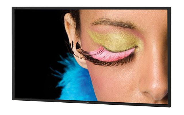
 NEC introduced colour-controlled large format displays under the Spectraview sub-brand. Image:NEC
For instance, in 2011, NEC tried to set a new standard for colour reproduction called DsRGB (I.e. “Digital Signage RGB” i.e. roughly similar to the sRGB colour space). They measured the tonal response characteristics of a large size display and defined a colour space within which graphic designers could create their artworks, defining a colour space to which the viewing displays should logically also be calibrated. That new colour space for the signage industry was officially announced and launched during the International Colour Consortium of FOGRA in Munich in 2011, and was subsequently registered. (FOGRA is a research institute for, originally the print industry, but these days for media technologies – Ed.)
This was the first ever effort made to standardize a dedicated colour space in the digital signage industry. But then it quickly fell into oblivion for operators of advertising display fleets were under no pressure from their clients to go that way, unlike the print industry. The initiative was not helped by the fact that the colour range of main stream large size displays barely reaches 72% of Adobe RGB in the first place, taking away some of its initial relevance.
.. But Cost is an Issue
The problem is as always, the cost. Large size LCD displays, which represent 95% of the total signage market today, are still expensive devices. Improving their poor colour performance to get closer to high end desktop monitors (which can reach over 103% of AdobeRGB for high-end monitors with IPS panels) would entail a significant cost increase. That’s because a wider colour space requires more expensive colour filters (with reduced efficiency) and features such as a ‘look-up table’ to save algorithms generated by a software calibration. This immediately would price them out of a very price sensitive market. The other main issue is that the PVA LCD technology often used in the large size category cannot offer good colour stability in wide angled viewing.
Sharp also tried to address this issue in 2016, by launching an 80” LCD Display with a 20% extended colour range to the market compared to the basic sRGB display colour space of standard displays in that category. That display was showcased on their ISE stand (in Amsterdam) in a side by side comparison with a standard 80” unit. The case was very convincing, and the press and visitors got the point. At the end of the show, the ISE jury granted them an innovation prize; unfortunately it was not for this major breakthrough, but for another 8K display that also was on their stand, as if a higher resolution was more important than an extended colour depth on a large size display which is to be seen from a distance. Not surprisingly, the commercial success of that display did not meet expectations in a market which only assesses products using three basic factors: size, brightness, price.
Samsung Tries QDs to Boost Colour
In 2017, also at the ISE show, Samsung made an even stronger breakthrough by revisiting the same subject with a full new QLED LCD range of large displays (using their Quantum Dot technology with a blue LED backlight) with a 4K resolution. This was the best of both worlds so to speak. and an absolute novelty in B2B applications
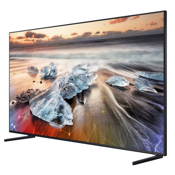
 Samsung’s QP82R 8K Display has QLED technology, but the web specification doesn’t detail the colour gamut. Image:Samsung
This remarkable new display range could even achieve 100% of the DCI-P3 colour space (which is very close to Adobe RGB), although they lacked the possibility of hardware calibrating them (like NEC did on some models) to offer a truly self-contained, RGB colour-controlled viewing environment. Although this remarkable new ‘QHH’ range represented a significant breakthrough in the signage Industry, the displays came at a price premium. The fact that it did not translate into a game changing success confirmed again the sad reality that while rich, precise colours have become a “nice to have” these days, they should not cost more (which is impossible).
The hard-economic reality always prevails and operators of commercial display fleets, or the DOOH industry are neither interested or visionary enough to turn this benefit into a differentiated value proposition to big consumer industry corporates. The value accurate colour may bring cannot offset the heavier procurement and maintenance cost required to achieve and maintain precise and extended colours. The problem has been made worse as the Signage Industry has gone to a SoC (System on Chip) architecture in the meantime, i.e. it now uses embedded chipsets for picture rendering these days instead of traditional PC’s and they cannot be calibrated.
LED May Solve the Problem
Eventually Samsung also learnt the hard way, and their wider colour technology is now only to be found on their ultra-big High-End 8K ‘QPR’ LCD displays. Indoor digital signage will anyway eventually follow the Digital Out of Home (DOOH) industry which already converted to LED’s and microLED’s (while sensitive larger OLED displays will probably know the same destiny as that of Betamax, certainly in B2B applications).
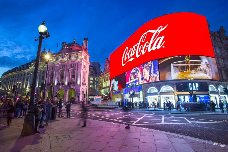
 Image:Ocean Outdoor. Click for higher resolution
The only single project I heard of, which was won on the back of a superior colour rendition, was the the famous UK landmark “Piccadilly Circus” project in 2015, where a particular LED display vendor was chosen on the back of a more satisfying Coca-Cola red colour rendering, for their omnipresent and powerful Christmas PR campaigns.
Micro LED’s will at least solve the first major problem of a need for a wider colour range which still plagues LCD displays, yet the ‘display calibration’ aspect, which, like in the print industry would be required to offer a precise colouring will remain a niche requirement, for example in health care, broadcast and defence or some security applications. While LED walls are calibrated during installation to obtain a colour consistency across the whole active screen area, they are not usually calibrated to any industry standard.
In the meantime, our own colour expectations, as individuals, or our ‘psychological’ capacity to accommodate colour differences in relation to a famous original logo of brand colour, is becoming more and more.. ‘flexible’ . The proof of the pudding for this is that one only needs to see the sort of ultra-saturated colour settings high street TV retailers demo their TV’s with these days, to understand that the modern digital viewer craves for ever more colour violence, not colour naturalness. (MB)
Michael Bailly is a veteran and specialist of the signage industry from the early days ,20 years ago. He specialized in display technologies while working at NEC in 2000, introducing large format displays and colour management monitors for the first time to the market, until he finally founded the very respected NEC Training Academy in 2010 in which he gave tutorials on display technologies. After working at Samsung EDO (Europe), he assumed a European director responsibility for product planning and marketing at Sharp Visual Solutions Europe where he introduced new SoC LFD display generations, building an eco-system of CMS software around them. He then switched to the software side of the signage industry where he is active at global level. You can reach him at: [email protected]

