A Kingswood, Surrey BBC engineer once told me that in his R&D lab, NTSC was an acronym for “Never Twice the Same Color” (Ha!) and even though this was a light swipe at our beloved TV color benchmark here in the USA, the fact is, his quip may be closer to the truth than most US based color engineers would like to admit.
![]()
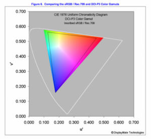
Fast forward way past the fat CRT TV era to the digital convergence time of today, and the discussion turns to two color standards likely to dominate the display landscape for years to come. Namely, the digital content rich standard used in for the past 10 years, sRGB/Rec.709 and DCI-P3 color Gamut used in digital cinema (which could move to the new Rec.2020 gamut). These are not to be taken independently mind you, but will require device support for both using new color management schemes. Now the issue is being looked at in earnest by DisplayMate Labs head, Dr. Ray Soneira who is just about to publish his Color Gamuts Review of DCI-P3 versus the existing standard sRGB/Rec709. The article gets to the heart of the issue of properly implemented color management by understanding visually and quantitatively just exactly what additional colors and color space DCI-P3 provides.
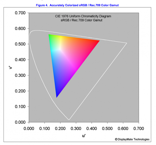
One good example of this issue coming to light recently was Apple’s April 2016 announcement that its latest iPad Pro 9.7-inch tablet upgrade supports both color gamuts, DCI-P3 because this is the path where content (UHD et al.) may be going and supports sRGB/Rec.709 because this is where the content currently is at. To Apple’s credit, the company did its color management in this device with enough quality to gain the “Best LCD Display 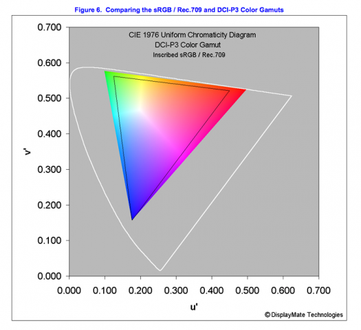 EVER” moniker from DisplayMate Labs (see our recent story New iPad Pro 9.7 “Best Performing LCD Display” – subscription required). Soneira’s Color Gamut Review carefully examines and compares the two standards and publishes colorized CIE Diagrams to help tell the story.
He points out that part of the importance of this work is that “…colors shown in most published Color Gamuts are wildly incorrect.” sRGB/Rec.709 has been around for over 10 years and is the current standard for virtually all content produced, from color cameras, to computers, internet plus film and TV. Matching this gamut is required to get the correct color the content producer intended. So counterintuitively, content with “…a larger color gamut is actually worse, potentially creating “distortions” for the viewer since the display cannot show colors that are present in the original content”.
Fortunately, we’ve come a long way from the early mobile computing days, and are now at a point where even mobile displays do a pretty good job of overcoming brightness and power efficiency issues to offer “…close to 100 percent of the sRGB / Rec.709 Color Gamut,” Soneira notes. “Not larger and not smaller.
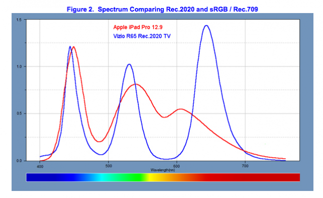
But the future is moving to bigger gamuts, for example, Adobe’s RGB color supported by some higher cameras and Samsung’s mobile OLED display gamuts are 17% larger than the standard sRGB/Rec.709. The DCI-P3 and future direction of UHD displays moves to 26% larger color gamut. Below is a spectrum analysis provided by Displaymate Labs that looks at both.
Rec.2020 moves us even higher still to a whopping 72% larger than the current sRGB/Rec.709 color gamut, and 37% larger than DCI-P3. “The Color Gamut is extremely wide and the color saturation extremely high. However, there is virtually no current existing content that use the whole of the gamut of Rec.2020. In fact, there are very few displays that can now come close to providing Rec.2020, which requires Quantum Dots (QDs) for LCDs . Of course, progress is being made so Rec.2020 will become an important and widely used Gamut within several years,” Soneira notes. (although, as far as I am aware, nobody yet claims to be able to meet the full gamut of Rec.2020 with LCD & QDs – Man. Ed.)
But as was mentioned, existing content is best with dead-on accuracy with its color gamut, or distortions will ensue. This is where the delicate art of color matching comes in, painting a new pallete of colors for the eye to see. So consider yourself warned, the gamut is growing along with sets to display these new rich colors the human eye never seen before, as we push the endeavor of display ever forward. – Steve Sechrist