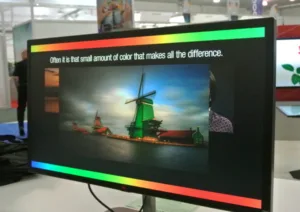
Two interesting things happened last week: Chris Chinnock, commenting on a story about a new laser projector, said, “It annoys me when multiple companies cite a color gamut spec of 110% of BT.2020. What they mean is the area coverage is 10% larger than the area coverage of the BT.2020 standard, because their RGB primaries do not align with the BT.2020 primaries. However, if you look at how much of the BT.2020 standard they cover, it is actually 90%. This is the spec they should report.” Chinnock also has this video on color gamuts from IFB that leads nicely into the second thing.
Jeff Yurek, VP of marketing at Nanosys-is-part-of-Shoei-Chemicals, gave me a heads up on a piece he wrote about how wide the color gamut of a Thursday Night Football match might be after I had written something about Amazon’s becoming a TV’s best friend because its HDR broadcasts of the games may end up convincing people that they need a better TV than any marketing by a traditional TV company or media outlet. Nanosys probably has the lock on being on the bleeding edge of wide color gamuts with its quantum dot technology, and has, for many years, rightfully boasted about that. I
The interesting thing about all this is that while both men are very knowledgeable about the subject matter, and offer great insights, and know their stuff, it really doesn’t address the fact that when it comes to the quality of a display, the industry seems only to talk to itself. Most consumers don’t have the expertise, or the time, or the resources, to put any stock into any of the arguments being made. They just have to take someone’s word for it. Even most reviews of displays are going to lack the level of depth needed to fully appreciate the specs of a product.
The problem is not the tech or the confusing acronyms and competing standards, although they don’t help, but the fact that there is no meaningful way for consumers to engage with the notion of color gamuts and what they mean to their experiences. The argument really isn’t about color, but about having a display that can see the original content in the way that it was meant to be seen. It’s a highly subjective goal that seems to cry out for something more than a general standard or spec.
Content Wants Better Displays
Back in the 90s, Jeff Yurek may have had a simpler time of determining what was possible with his tests because there wasn’t much choice. Here in the US, the NTSC color gamut was first developed in 1953 as part of the NTSC broadcast standard and was prevalent. It defined the range of colors that could be reproduced on NTSC-compatible displays. It was based on the capabilities of the technology at the time, including CRT displays and the NTSC broadcast standard. The NTSC color gamut had a big influence on the development of color displays. It was one of the first standards to define a color gamut for digital technology, and it served as a starting point for future color spaces. For example, the sRGB color space, which is now one of the most widely used color spaces, was developed in 1996 by Microsoft and Hewlett-Packard as an improvement on the NTSC color gamut. They took into account the NTSC standard and improved on it to create a color space that would work better with computer displays and digital cameras.
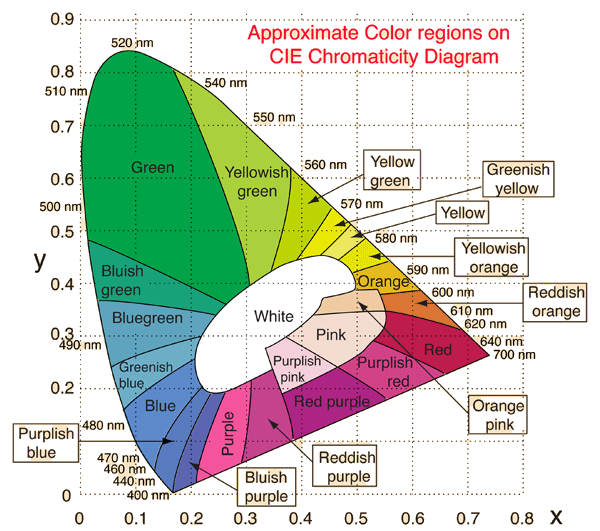
The CIE system characterizes colors by a luminance parameter Y and two color coordinates x and y which specify the point on the chromaticity diagram. Color gamuts are usually represented by regions within this horseshoe shape. No confusing at all. (Source: GSU)
But, today’s main standards are driven by the movie industry. DCI-P3 (Digital Cinema Initiatives – Projection) was created in 2005 by a group of major movie studios. They wanted to create a standard for digital movie projection that would be even better than existing standards, like sRGB and Adobe RGB. To do this, they needed to create a color space that would support the full range of colors used in digital cinema. The next big advancement in color spaces came in the form of Rec. 2020, which was created by the ITU-R (International Telecommunication Union – Radiocommunication Sector). Rec. 2020 is considered the successor to DCI-P3, and it’s designed to support the ever-growing range of colors used in modern technology. It has a much wider color gamut than DCI-P3, and it’s also designed to support high dynamic range (HDR) content.
Rec. 709 was an earlier color space standard created by the ITU-R. It was created in 1990, and it’s still used today in broadcast television and some other media. It has a smaller color gamut than DCI-P3 and Rec. 2020, and it doesn’t support HDR. But it’s still an important color space because it’s widely used and many people’s TVs and computers are still optimized for it. The main reason these standards were developed is to ensure that content creators and equipment manufacturers are all on the same page. It’s crucial that everyone has the same understanding of how color should be represented, so that content will look the same no matter what device it’s viewed on.
The major forces pushing for one standard are organizations like the ITU-R, the SMPTE (Society of Motion Picture and Television Engineers), and the UHD Alliance. These groups are all working on various standards and specifications that would create one universal standard for color. One of the most promising contenders is the Rec. 2100 standard, which is being developed by the ITU-R. It aims to combine the features of Rec. 709, DCI-P3, and Rec. 2020 into a single standard. It’s still in development. However, none of these standards really address their implementation, they just define a mathematically consistent representation of color, as expected to be seen by the human eye, that can be translated across all devices.
Even if a TV or monitor says it supports a particular standard, like HDR, it doesn’t necessarily mean that it will have the same quality or performance as another device that claims the same support. There are many variables that can affect the implementation, including the quality of the panel, the quality of the internal hardware, and the quality of the software and firmware. Yet, at the end of the day, the goal is to match the intent of the content creator.
Standardize Color Calibration
Having standardized color calibration, that is followed by all manufacturers, would be very helpful, so that consumers can make an apples-to-apples comparison, as well as have consistent means of matching their displays to the intent of the content creators. More than anything else, color calibration could be standardized to level the playing field for consumer education purposes, too. There needs to be one color calibration app that rules them all. It’s about the only way to force the consumer to take the issue of color seriously, or to help the understand how it works.
Let’s look at that another way. There is an International Display Measurement Standard (IDMS), and it’s basically a set of guidelines and procedures for measuring the characteristics and qualities of electronic displays. It’s great. Gives the whole display industry a foundation for performance analysis, if nothing else. The IDMS covers things like color accuracy, brightness, contrast ratio, and other important display metrics. It also provides guidance on how to set up the testing environment and how to interpret the results. The IDMS doesn’t account for things like the viewing environment, the user’s position relative to the display, or even the ambient lighting. These factors can all affect the perceived performance of a display, and they’re not taken into account by the standard. This is why there are often discrepancies between the measured performance of a display and the perceived performance in real-world conditions.
Consumers, reviewers, anyone not working in the display industry, would have a hard time measuring the output of their displays. Yet, there are so many ways that it can be done. If the industry agrees on one standard color calibration application, it could make the specifications more meaningful as well as improving the general perceptions of display quality. It won’t happen, but it should. Something has to be done to make the management of color a process that is exactly the same across all devices. That would give the standard bearers a way to see how well devices match up to their expectations, or the expectations of their content masters.