Game of Thrones (GoT) Episode 803, “The Long Night”, recently took over social media – with fans complaining about the cinematography and color grading, delivering scenes so dark the images were nearly indecipherable. The epic ‘Battle at Winterfell’ was the culmination of 80 episodes of anticipation and had an overnight viewership of 17 million(!). Yet the next morning HBO woke up to news headlines they were not expecting.

‘The Longest Night’ news stories & social media complaints
The social media complaints were compiled into ‘news stories’ by the media, offering very little context of what actually went wrong with GoT’s images. Newsweek got a response from Cinematographer Fabian Wagner that blamed viewers for improper TV settings. HBO replied that they had ‘no issues across their platforms’. Stories in the New York Times and Slate suggested overly dark cinematography (and by extension, color grading) was to blame and the creatives should have done more to anticipate these problems.
As a professional colorist/evaluator of television images, I have some thoughts on what went wrong – and solutions
Wagner has a point about improper TV settings but HBO also bears responsibility for this failure of image quality.
In my personal experience (that resonates with many professional finishers and colorists I’ve talked to), HBO’s OTT streaming image quality is, on average, average. On Premiere nights, anecdotal evidence suggests OTT image quality is inferior as images are dynamically compressed to manage large bandwidth demands.
In my mind, therein lies a large part of HBO’s problem: poor compression techniques. Red’s Graeme Nattress nailed it when he responded to me on Facebook, (paraphrasing) “Excessive compression reduces dithering, revealing banding artifacts”. Revealing, indeed.
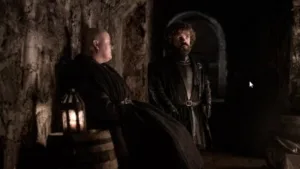
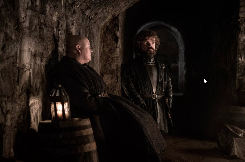 Image:HBO via winteriscoming.net
Ambient light, Banding, HBO and the television industry
I believe the problem most viewers had were a combination of:
- Excessive ambient lighting – As any colorist will tell you, lights turned on in the room washes out your blacks, eliminating visual detail. If all your significant story detail is in the darkest parts of the image (as fully half the episode of ‘The Longest Night’ was) and the lights in the viewing room are too bright, all you see black. I used to go to premiere parties at friends’ houses for previous Seasons and don’t bother anymore… they always have too many lights turned on and the action is lost into murky blacks.
Without a viewer warning that the images were designed for ‘cinematic viewing conditions’, audiences were not prepared. Shadow detail (and story detail) got lost and social media was filled with people turning off room lights 15 minutes into the episode.
- HBO’s compression on its OTT streams creates its own problems – In my experience, there is a historical problem with HBO Go and HBO Now, compared to other premium streaming services. HBO seems to serve up images with a compression scheme that excessively removes necessary dithering. This dithering is designed to hide banding/posterization. When the dithering is removed, banding/posterization is revealed – especially in shadow detail.
In ‘The Longest Night’ with all the subtle shades of gray (with highlights barely 15% above black) conveying all the significant detail in those images, HBO’s streaming viewers were left with big muddy blocks of posterized detail. Visible details blended in with the posterization artifacts – confusing viewers’ eyes. They couldn’t see the action.
Since HBO content is HD, upscaling posterization to 4K sets probably doesn’t help. Viewers with WRGB OLEDs, like LGs, further suffered from that display technology’s well-known problems with posterization artifacts, again, when stepping out of black. Those particular artifacts can be avoided in the color grading suite but there isn’t an ‘HBO Dithering Removal Simulator’ plug-in allowing professionals like me to anticipate this kind of distribution artifact.
As an aside: In conversations with other pros, the iPad streams don’t seem to suffer these problems – suggesting HBO is using a more robust compression scheme for that platform (or maybe the smaller displays help hide these artifacts?).
Were the DP and Colorist to blame for not anticipating the ‘dithering removal effect’?
Personally, I don’t think so. As professional content creators, we should have every reasonable expectation that the images we see in a reference suite are reproducible in the final distribution viewing conditions.
Game of Thrones is a cinematic episodic of epic proportions. It’s not a daytime soap where it is difficult for home viewers to control ambient lighting conditions. Given that I’ve seen dozens of dark, dim images on Netflix, AppleTV, Vudu, and cable tv – and almost never with the posterization problems that plagued Game of Thrones 803 (and HBO streaming, generally) – this isn’t a failure of the craft. It’s a compression/distribution failure. It’s also an industry failure.
The way I see it, there’s one temporary fix and two long-term solutions to this problem.
The quick fix takes place in color grading suites. Until OTT distributors improve their streams (to be clear, HBO is not the only OTT service suffering from sub-par compression schemes), my co-founding partner at MixingLight.com has penned this piece on simulating consumer displays in reference mastering suites. In my opinion, this is a temporary fix. Longer term solutions are preferable.
Solution 1: Premium OTT services need to prioritize optimizing their codecs and apps
It’s not just banding that’s a problem. I don’t intend to pick on HBO but in 2018 I canceled HBO Now on the Apple 4K box because it looked like it incorrectly interpreted video levels as data levels. Then, the app lifted those data levels to video, resulting in lifted blacks – washing out their overly posterized images, driving me insane. This GoT season, I activated HBO via Amazon Prime on the LG app (to bypass the AppleTV 4K box) and the misinterpreted blacks aren’t a problem.
Solution 2: The Industry needs to educate its consumers
Our industry is part of the problem. We’ve started seeing campaigns by filmmakers urging viewers to turn off motion blending. That’s a start. But how about teaching viewers how to watch our highly cinematic programming? How about the industry taking visible steps informing viewers of content that benefits from reference level viewing (especially HDR content)?
I agree that we seem to be living in a golden age of television programming. It’s plentiful, creative, and, under proper viewing conditions, highly immersive.
Doesn’t our industry have an interest in teaching our customers the best way of consuming our product?
We are entering an age where consumers can actually see the images almost exactly as how the filmmakers intended. It’s a shame no one knows how to do so. We are failing our audiences.
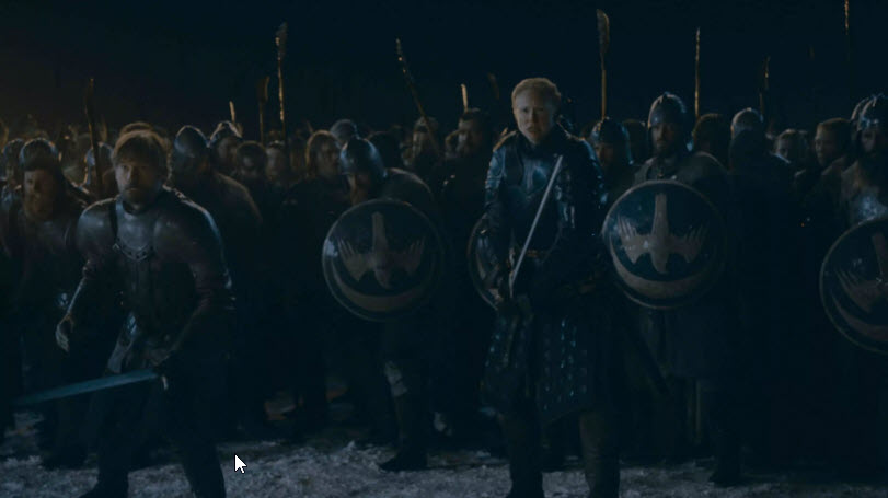 Image:HBO via winteriscoming.net
In Game Of Thrones Episode 803, audiences noticed our industry’s failure
Yes, HBO partly brought this on themselves. But the industry as a whole needs to sit up and pay attention to how the masses are recognizing these quality lapses. The industry needs to more visibly support initiatives similar to the ISF Mode on newer television displays.
But as currently implemented, ISF modes on modern high-end televisions are not enough – because audiences don’t know about them! But they represent the direction we need to take. Not only do we need television manufacturers implementing industry ISF-style modes (that also include turning off all the image nonsense that ruins cinematic viewing of reference graded images), viewers need to be visibly informed when they are watching reference graded programming.
At the very least, audiences need to be told, “Hey! Turn down your lights.”
‘Mastered for Cinematic Viewing’
In my fevered imagination, warnings for explicit language and strong sexual content are supplemented with a ‘mastered for reference level viewing’ advisory. I imagine a Board from ISF, SMPTE, IBC teaming up with craft organizations like the ASC and CSI. Their goal: Craft a display advisory informing viewers to enable their ISF mode – and mimic reference viewing. The logo on the advisory warning needs to match the logo on their TVs, to help tacitly guide viewers to the correct settings on their televisions.
This quick-access reference/cinematic mode needs a more stringent level of image display settings than the current ISF Mode requires. Of course, my imaginary Board needs to enlist Netflix, CBS, NBC, ABC, FOX and other major distributors to promote and display this advisory for their most appropriate content.
As our industry pushes toward HDR, a ‘Mastered for Cinematic Viewing’ advisory becomes even more important. HDR isn’t just about brighter pixels. It’s about brighter pixels while simultaneously showing near blacks. We need our audiences to turn down their ambient lighting to truly see the potential of HDR and an advisory like this can go a long way in educating them.
Image Quality Is A Competitive Advantage (or weakness)
HBO was built on quality. Quality programming. Quality sound and images. Quality distribution. As a former employee at HBO Studio Productions, I’m saddened to see their willingness to degrade the quality of their product on their OTT services.
But maybe we can all turn this into an opportunity? An opportunity to raise awareness at the C-level of these multi-billion dollar organizations that technology is outpacing their customers’ awareness of how to consume their product. The status quo needs to change.
But for now, my solutions are only a hope. Hope isn’t a strategy. If you agree with me and know someone at one of these organizations who can execute changes, then forward this URL to that person. Our audiences deserve more. They deserve to see the excellence we create on their behalf.
The industry needs to help audiences learn how to consume our excellence.
Personally, I can’t wait to see GoT 803 on BluRay. It looked like a gorgeously captured and color graded episode. (PI)
————
Patrick Inhofer is a professional colorist currently based in Orlando. He is also co-founder of the color grading training website MixingLight.com. This article is adapted from an issue of his weekly color grading Newsletter.
Editor’s Note
I’m a regular viewer of Patrick’s weekly email and always enjoy it. Thanks to him for updating these comments and allowing us to reproduce them. (BR)