
A recent spot-on article concerning web page user interface design and information display on computer monitors came across my screen a week or more ago. I might have forgotten the article except that I experienced precisely the user interface design deficiency cited in the article from the Nielsen Norman Group (NN/g).

The NN/g article by Katie Sherwin was titled Low-Contrast Text is Not the Answer. This design element used by some web sites has irritated me for some time now. Yesterday, I was changing my Apple iTunes password and encountered precisely the low-contrast text web page design called out for criticism by Ms. Sherwin. The NN/g article started with a summary conclusion which read, “Low-contrast text may be trendy, but it is also illegible, undiscoverable and inaccessible. Instead, consider more usable alternatives”.
As is the norm for NN/g, their criticism was both insightful and incisive. Sherwin began her article stating: “A low-contrast design aesthetic is haunting the web, taking legibility and discoverability with it. It’s straining our eyes, making us all feel older, and a little less capable. Lured by the trend of minimalism, sites are abandoning their high-contrast traditions and switching to the Dark Side (or should I say, the Medium-Gray Side). For sites willing to sacrifice readability for design prowess, low-contrast text has become a predictable choice, with predictable, persistent usability flaws”.
The web page (below) was cited as an example of the low-contrast design approach.
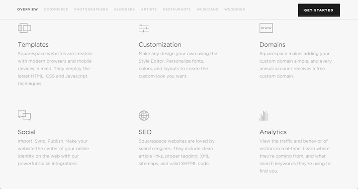 Source: Nielsen Norman GroupAs even the casual observer would note when viewing the illustration above, the web page is just hard to read and utilize. Sherwin offered more considered opinions as you would expect from a user experience (UX) professional. She makes and explains the points listed below concerning the low-contrast design.
- Legibility suffers.
- Discoverability and findability are reduced.
- User confidence diminishes.
- Mobile use becomes even more difficult.
- Accessibility is severely reduced for users with low vision or cognitive impairments.
- Cognitive strain increases.
I noted ironically that Sherwin’s next low-contrast design example was from Apple’s website (pictured below). Sherwin critiqued the Apple design example asking first; “Can you tell which page the user is on?”
 Source: Nielsen Norman Group
She went on to explain the basis for her critique noting; “The current location (Support) on the Apple.com website is conveyed by dimming the gray text to a darker gray. Navigation is an especially risky place to use low contrast, as users may perceive their options to be limited, or they may waste time trying to figure out where they are in the site”.
My recent personal experience when resetting my iTunes password at Apple’s website was similarly hampered by the limitations imposed by a low-contrast design. In the past, when I visited a website, or encountered an HTML email, with low-contrast design, particularly in extensive text that was in fact the principal payload of the page, I have, after trying to read the body, simply given up and in future simply avoided visiting or reading the HTML page featuring such a design, with its attendant poor legibility.
In her NN/g article Sherwin provides an analysis of why designers use low-contrast text which was helpful. She also went on to recommend alternative web page design strategies. From my perspective, when I encounter a low-contrast design I just say no and move on, unless of course I really have to reset my password. – Phil Wright