
The judicious use of color in the symbology presented on flat panel displays has long been recognized as both a user preference and as a means to improve user performance. Given the increasing commercial presence of Head Up Displays (HUDs) and Head Mounted Displays (HMDs), there has also been a corresponding increase in the importance of clearly understanding the human factors that relate to the use of color symbology in these devices.

An investigation to address some aspects of this issue has been undertaken by a team of researchers led by James Blundell of the Centre for Mobility and Transport, Coventry University (Coventry, UK). A recent article on this topic by the team is entitled “With flying colours: Pilot performance with colour-coded head-up flight symbology.” It is to be published in Displays, Volume 61, January 2020, 101932. A copy of the article can be found here.
First, a few words of background information paraphrased from this article.
The extent of user attention required to identify and interpret a target symbol in a display screen containing a complex set of symbology can be “minimized by pre-attentive processing when the target stimuli differs from noncritical information on a single dimension.”
Put more plainly, the goal is to make the target symbol “pop-out” of the display. An example of this would be to make the target symbol red in a display where all the other symbols are green.
Symbology can also be varied along multiple dimensions. Consider the case of two dimensions, such as color and shape. Pre-attentive processing could isolate a group of likely candidate symbols based on one dimension (color) but, then, explicit user attention is required to further inspect the reduced symbology set to identify shapes of that specific color.
It is reasonable to expect user performance to be somewhat slower in the two dimensional case. The reason is that explicit attention is required to inspect individual items within the reduced symbology set in serial fashion until the target is located. Nevertheless, user performance will likely still be superior to the case without color coding.
Based on this rationale, color symbology has been successful applied to the design of flat panel displays for many years. On the other hand, the display technologies utilized in HUDs and HMDs are both different from and less commercially mature than that used in flat panel displays. It is, therefore, not surprising that the human factor considerations related to the use of color symbology in these devices has been less investigated.
A specific intention of the Coventry University study was to evaluate the performance and workload benefits related of color coded symbology as compared to monochrome symbology in the head-up flight application.
Rather than creating a physical HUD or HMD platform for use in the experiments, the team decided to present an artificial overlay on a flat panel computer screen. That is, the team produced what is, in essence, an “artificial HUD.” This approach did, of course, “create an ‘offset’ in terms of visual acuity and human performance.” Regarding this offset, the researcher commented that “the primary focus of their study was to examine the cognitive effects of color and not assess the focal demands of the display.”
The figure below contains examples of the color coded symbology presented on the display.
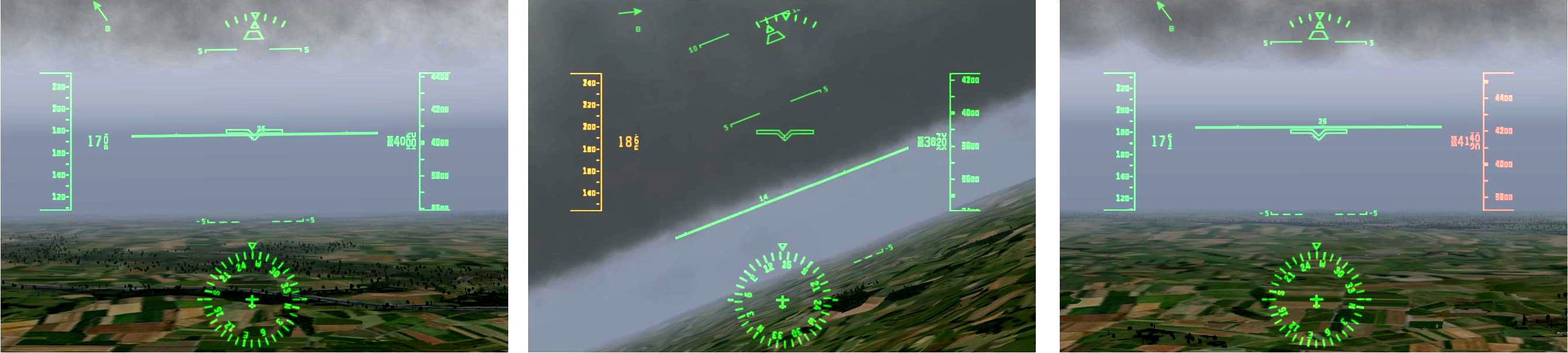 Examples of the symbology presented on the artificial HUD display. Left: Straight and level flight profile requirements within limits (symbology all monochrome green). Center: Minor indicated airspeed limit breach (amber IAS tape) during climbing. Right: Excessive altitude limit breach (red altitude tape) during straight and level flight. Click for higher resolution
The article provides a great deal of detailed information on the set up, methodology and results of the experiments. The main finding of this study was that head-up color coded symbology improved the performance of both professional commercial pilots and non-professional pilots during low workload, manual flying tasks. An additional finding was that there was no perceived subjective workload benefit of color coded feedback. Another, perhaps unsurprising finding was that user’s preferred color symbology versus monochrome symbology.
The researchers close their article with suggestions for further research. Separate and apart from the aircraft application specific research reported in this DD article, investigation into the human factors of color symbology in other HUD/HMD applications seems desirable. -Arthur Berman
Coventry University, James Blundell, [email protected]