Apple did not disappoint at its recent event by announcing ‘one more thing’ – the Apple Watch. The name is not the iWatch, as the trademark is held by another company. Nevertheless, the Apple Watch did not disappoint in delivering new ways of use and control. Apple calls it the most personal device it has ever designed.
Apple made a point of highlighting the new modes of User Interaction (UI) in its successful products over the years. This has developed from the computer mouse and iPod click wheel to multitouch on the iPhone. The company say that every form factor of a CE device requires a specific user interface to make it work. There is certainly a good amount of truth to this statement.
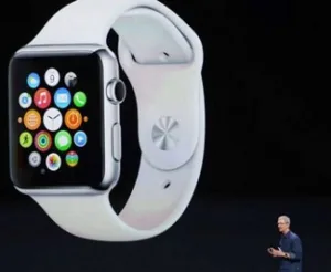
Amazingly, Apple came up with a unique – or, actually, very common – UI for the Apple Watch, called the Digital Crown. Like other wristwatches, since the first ever models built, the Apple Watch has a wheel (the crown), which in this case is not a way to wind the watch, but a way of controlling and navigating the menus. As Apple points out, most multitouch interfaces used on smartphones today will not work on a smartwatch; the display is just too small for multitouch input. The Crown can be turned to select menu items or zoom in, depending on the software environment. It can also be used to launch Siri.
The display itself is touch enabled, but goes one step beyond the typical touch interaction. Apple had previously filed for a patent that enabled pressure-sensitive touch; this technology makes its debut in the Apple Watch. Apple calls this feature ‘Force Touch’. The ‘Taptic Engine’ provides haptic feedback for touch-based input.
Very little information has been released on the device’s specifications – almost nothing, to be exact. Apple focused its presentation on the user interface, which looks very slick indeed (formed of a circular ring of apps, rather than separate screens), and the provided functionality based on fixed and installable apps. The dimensions are not being released today, but there are two sizes available: 38mm (1.49″) and 42mm (1.65″).
The Apple Watch has a flexible retina display, which appears to be of the full colour AMOLED type, although this was never mentioned specifically. However, since the display is being pressed to actuate a sensor behind the screen, it is a fair assumption that a plastic substrate-based display is being used. There is no display resolution or brightness specification, as Apple may still struggle with the display deliveries. The company did confirm that at least some models will come with a sapphire screen.
Overall the Apple Watch looks a little chunky, but seems to fit the wrists of the Apple executives showing them off at the event. This means that the overall size is not too large compared to some other smartwatches. As for the fashion appeal, Apple acknowledged the fact that watches are as much a fashion statement as a timepiece. This is their angle on the Apple Watch.
* The Apple Watch is first of all a time piece (with 50ms accuracy) – not a computer
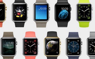
* There are plentiful option of various watch face layouts and set ups
* It looks like a real watch, with the Crown as an input device
* There are three different models: Apple Watch, Apple Watch Sport and Apple Watch Edition
* There are plenty of wristband options
* Apple has created new ways to connect with other Watch users and send messages
* The device acts as a sport and fitness companion
* Siri (somewhat expected) is integrated for voice input
* A software development kit for app developers will be available
* The Watch has wireless charging and is capable of Apple Pay (a wireless payment feature using NFC)
As you can see, Apple seems to have done it again. Take the time to think about what the user may want do with the Apple Watch. Show them in a perfectly arranged presentation to make people want them. Pure marketing magic at work.
From a technology standpoint the display touch interface is certainly of great interest, as are the wireless charging and NFC technologies. There is also a heart rate monitor on the back of the Watch. The fitness, messaging and voice activation features are more or less expected on a smartwatch today.
From a marketing and design perspective Apple created a wide array of potential users by creating three model lines (Apple Watch, Apple Watch Sport and Apple Watch Edition). These vary by case material (from aluminum and stainless steel to gold) and band design (from metal mesh to leather and plastic). Changing the band is easy and can be done after taking a shower to use Watch for a night on the town, and if you don’t know where to go Apple Watch can help you with that as well. The design itself is, in typical Apple fashion, a clear statement. However, the recent releases of smartwatches shows that Apple is not the only game in town anymore.
The Watch will be available in early 2015 at a starting price of $350 – although I guess that this is not for the gold model! The price may be a little high, but it is in the realm of other models.
Display Daily Comments
So, overall is that enough to ignite the consumers’ interest in the wearable sector, as many are hoping? I think that the user interface and wide configuration options sets the Apple Watch apart from other models. Designed as a companion for the Apple iPhone 5 or newer models, there is a wide potential user group already existing; a group that Apple wants to tap into, but widespread adoption is still some time away. – Norbert Hildebrand


